Graphic Design Vernissage Poster
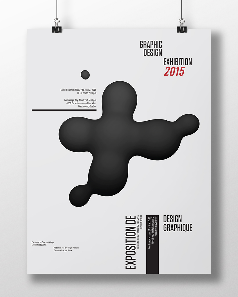
My design for Dawson College's 2015 Graphic Design Vernissage. The main element, a large plus (+) sign, signifies the postivity the graduates have leaving the program. In addition, it reflects the skills that we have added to our toolset throughout the three year program.
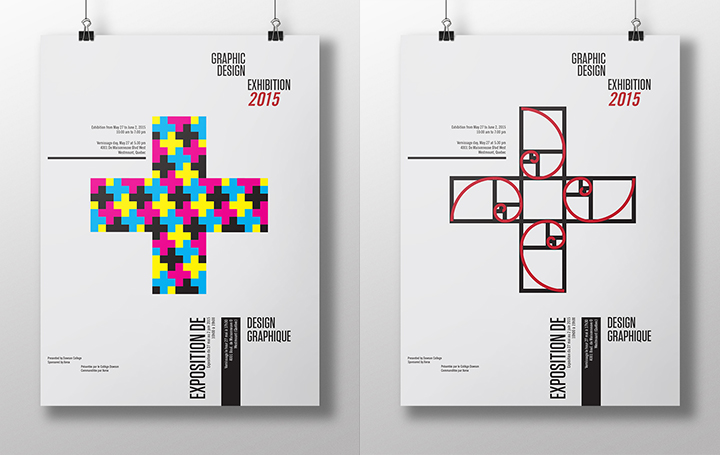
Although the primary design uses a blob as a main element, a nod towards one of the fundamental lessons taught in Dawson's GD program, it can be swapped for other visual styles that still show the symbol of a plus.


