PERSONAL RE-BRANDING
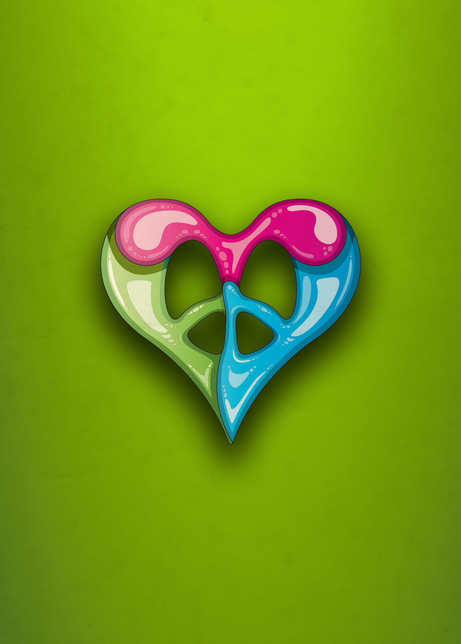
It is no secret that my biggest musical and visual influences come from the colour schemes and general aesthetic of the posters and album artwork that was being created throughout the 1960s and 1970s. I had come up with the name Field Trip Designs to commemorate the excitement you got as a child when you got to go on a field trip. Venturing off into the great outdoors, meeting new people, seeing new sights, riding new subway lines, packing a lunch... All of it brings back such excitement and nostalgia. The letters F, T, and D work perfectly to form a heart-shaped peace sign, perfectly summing up the two most powerful and prominent themes from the Sixties, as well as an ongoing message throughout my designs.
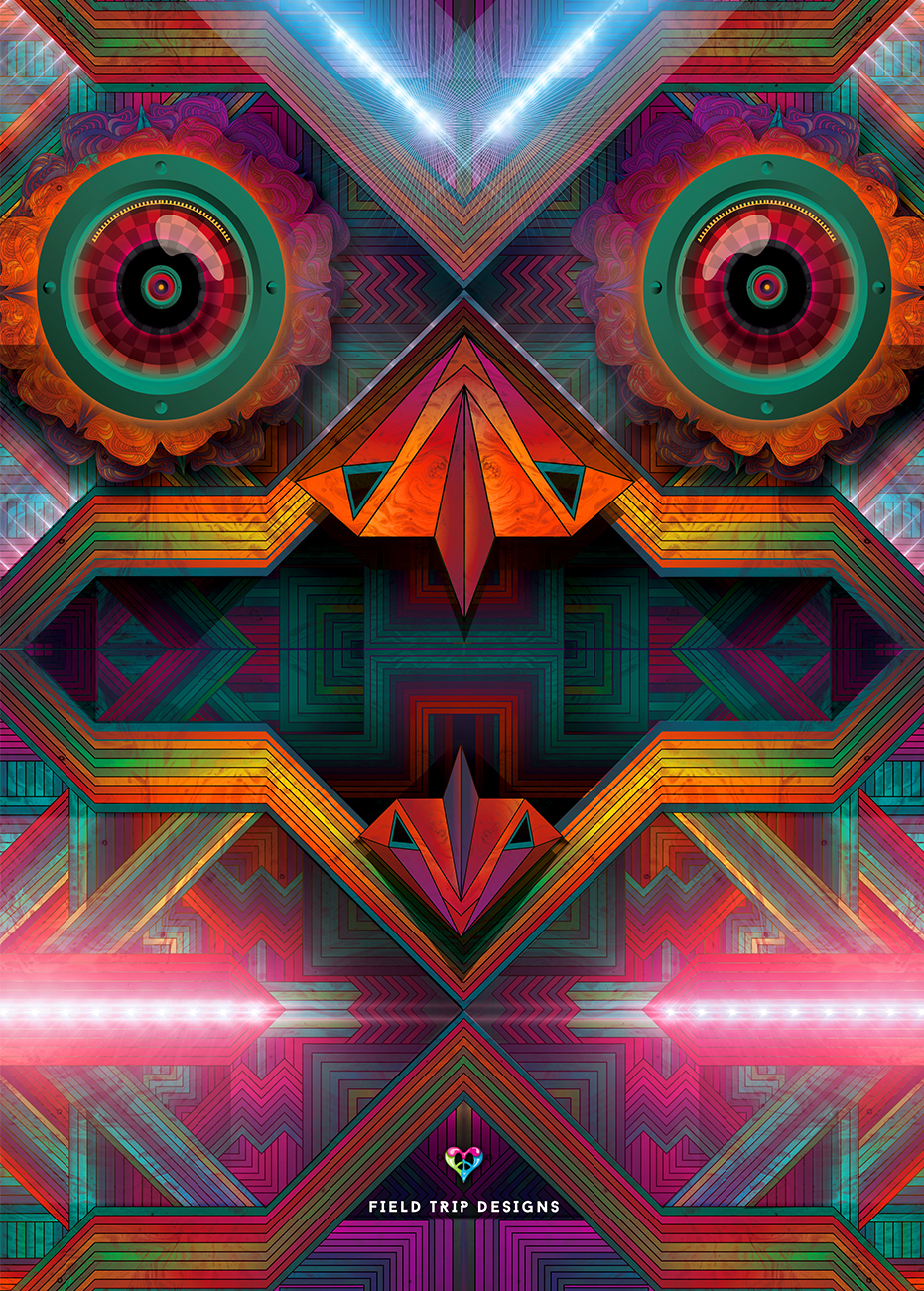
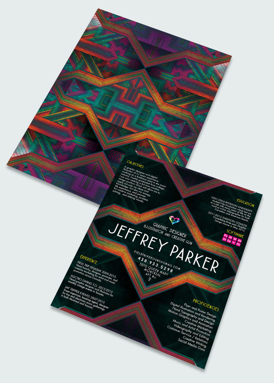
The owl image is an illustration I created as a folder for my promotional package, and it can also be used across a wide variety of other platforms and applications. The pattern itself in the background works beautifully as textures and the back image of many documents and pages. "Jay bird" is a bold and revolutionary night owl that has evolved to shine its own light in ways that no other can. I feel a lot of connection to this image and I love that both its intensity and striking facial features almost scream at you from both the page and the screen.
Back to Illustration...


