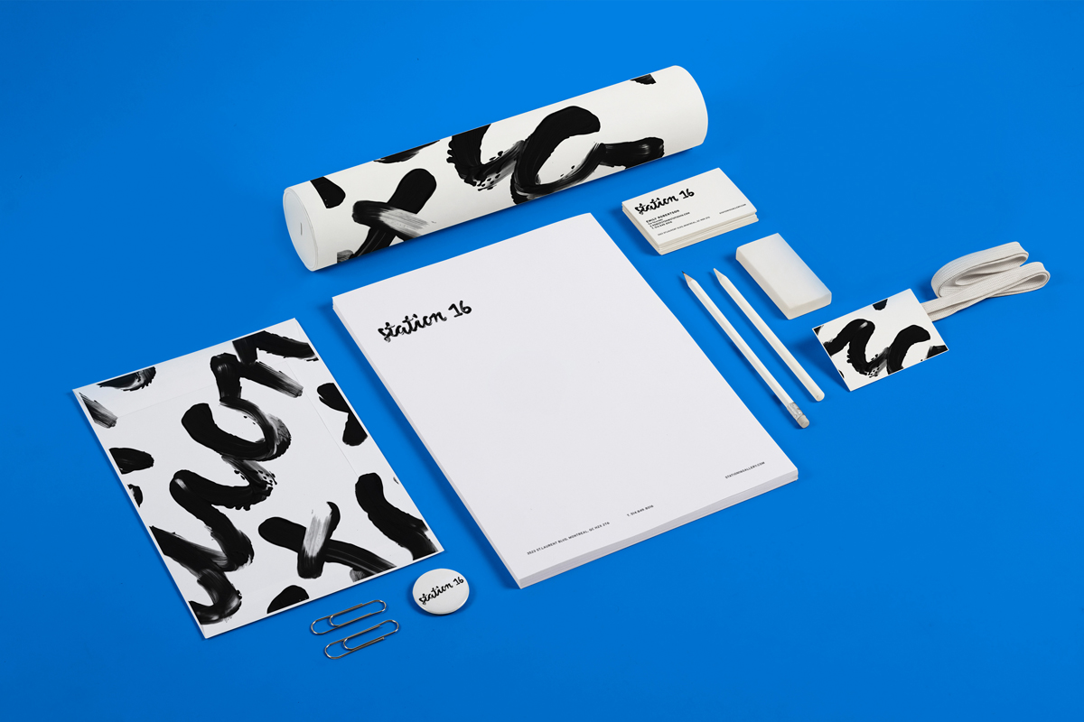
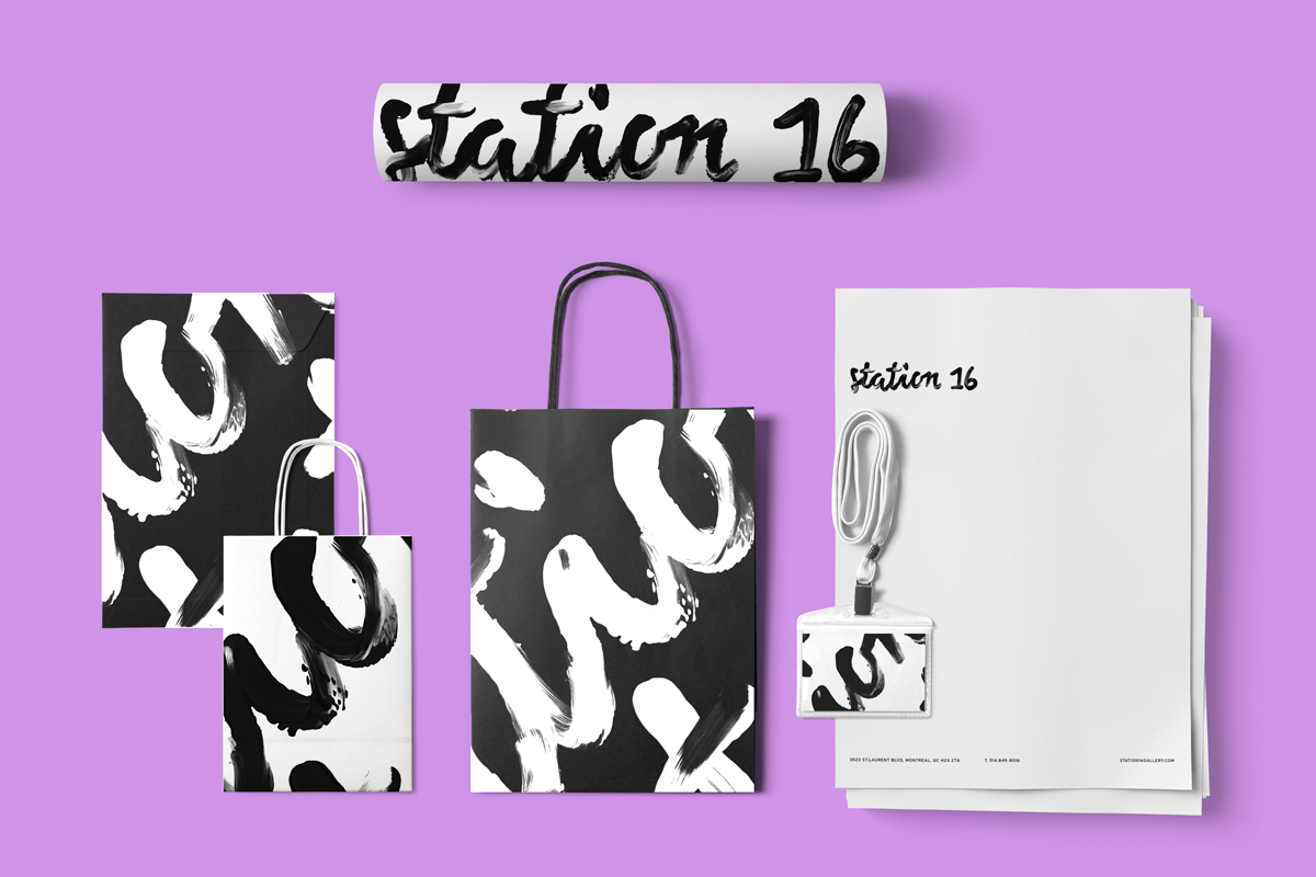
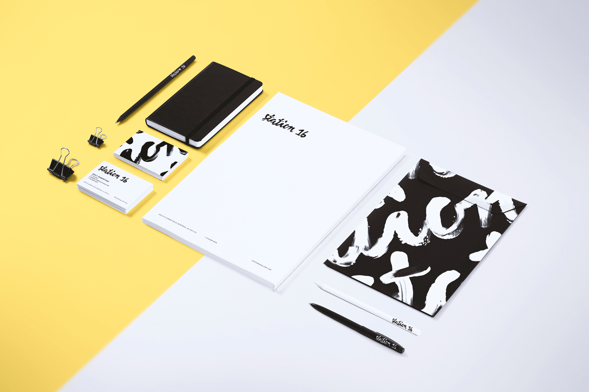
STATION 16
CORPORATE IDENTITY
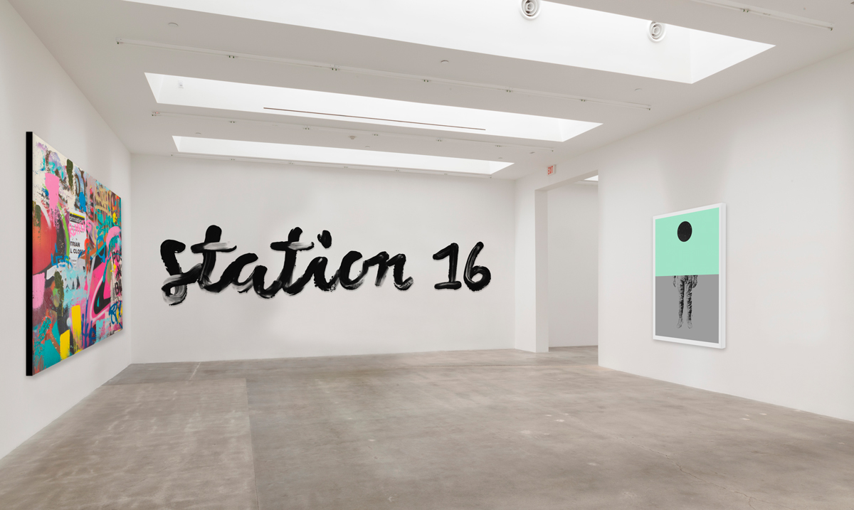
Located in downtown Montreal, Station 16 exhibits work by an international roster of contemporary urban artists who are influenced by illustration, design, pop culture, graffiti and street art. They strive to showcase new inspirational work, often overlooked by traditional galleries. But the gallery has a confused identity, which mixes retro vintage, circus and art deco. A new identity that is more contemporary, urban and hints at their passion for silkscreen was the mandate for this project.
Station 16 is a young gallery with an energetic soul. Not afraid to show the art scene their true colors, they are as avant-garde as they come.
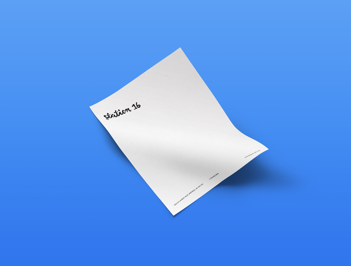
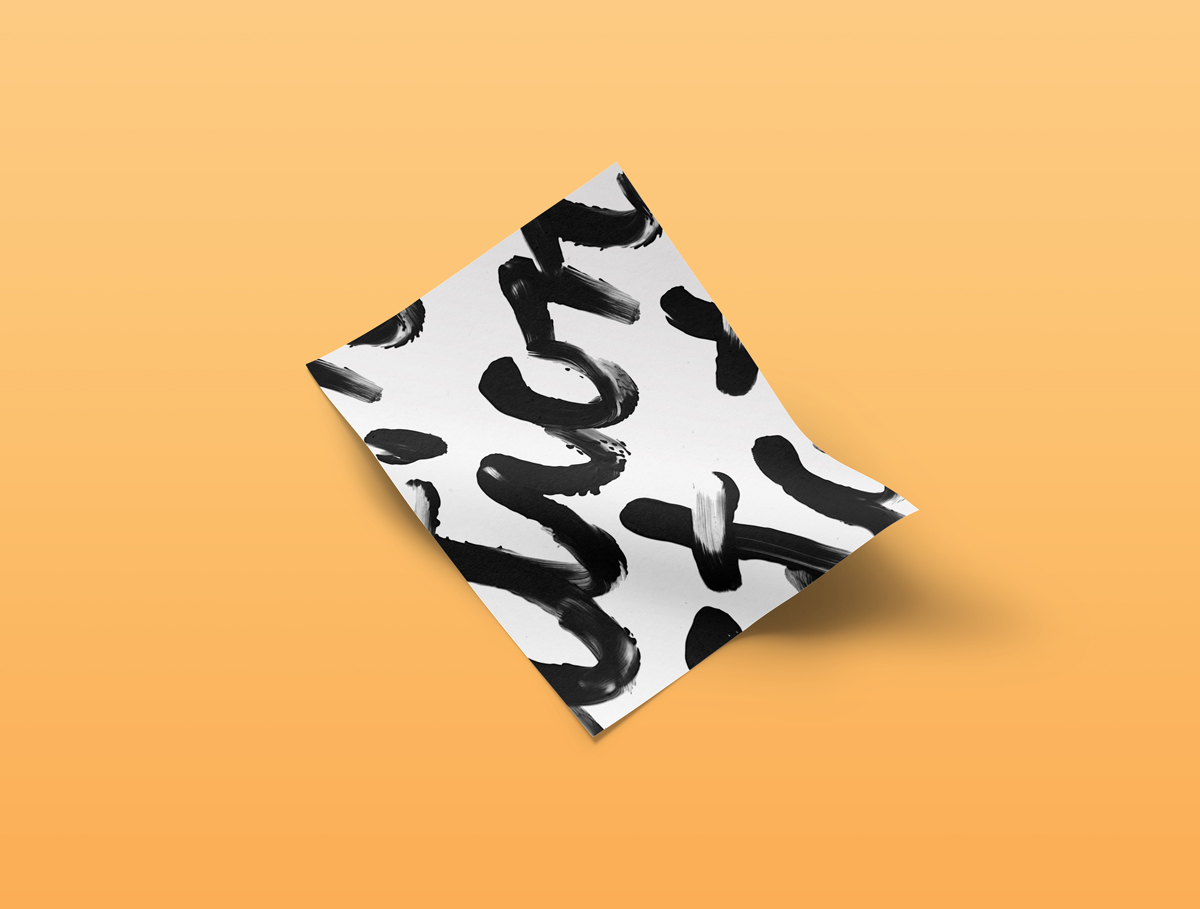
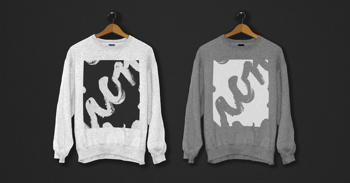
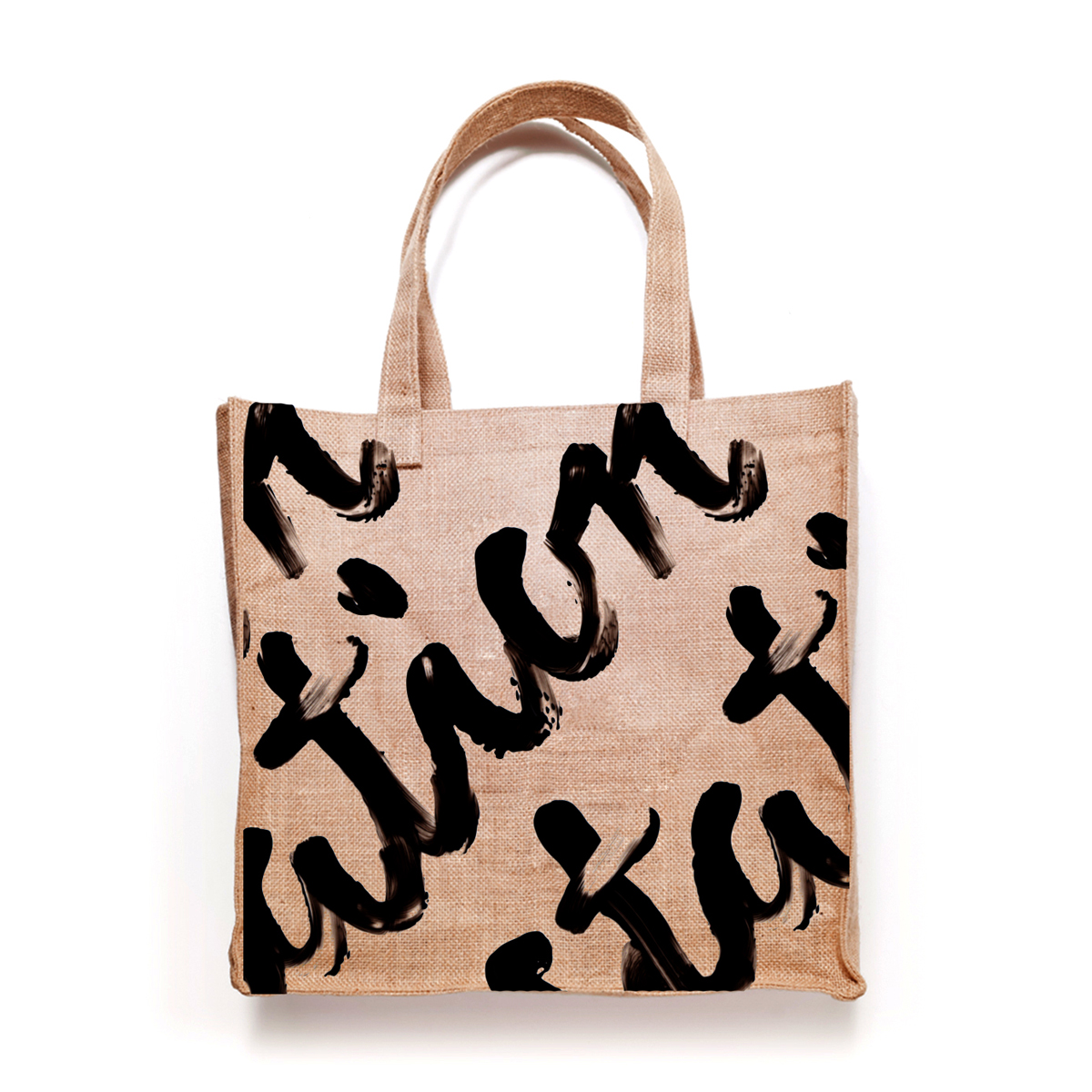
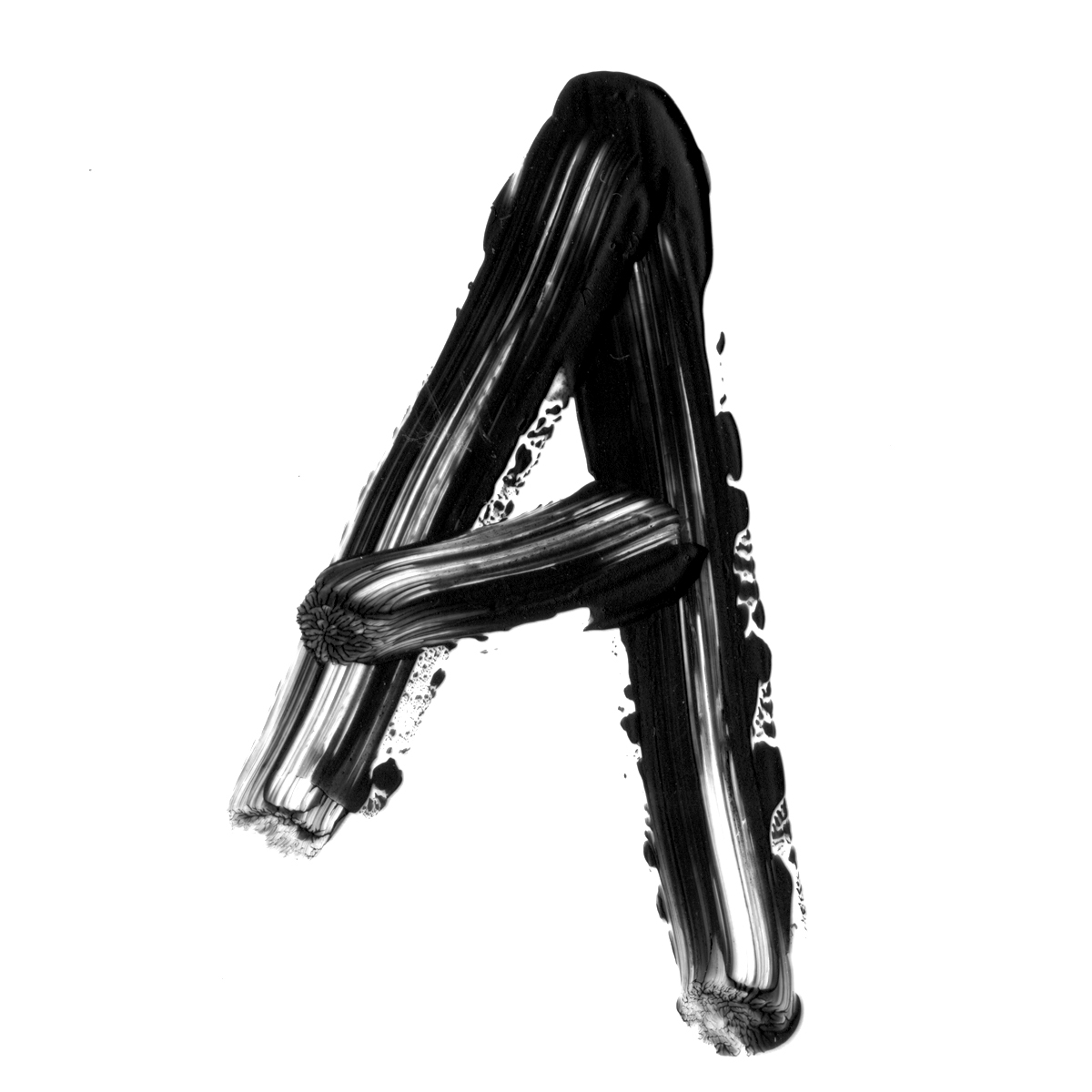
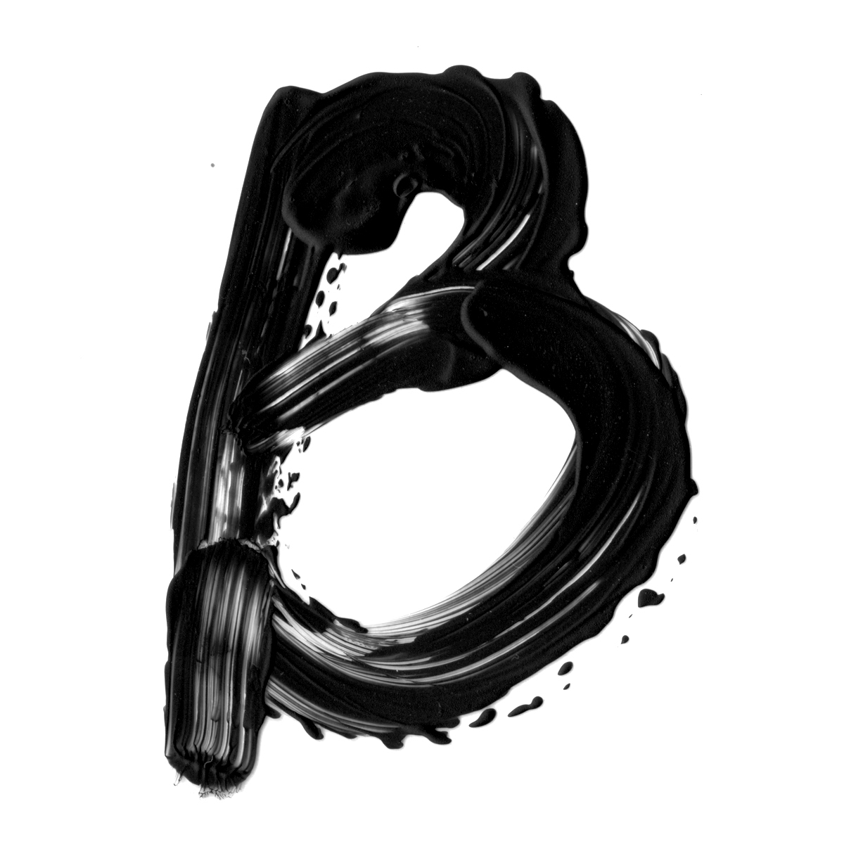
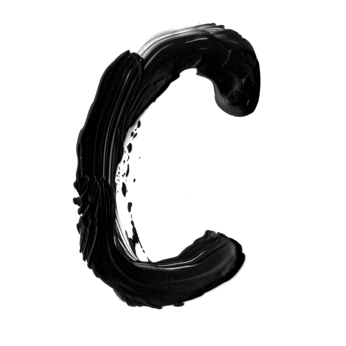
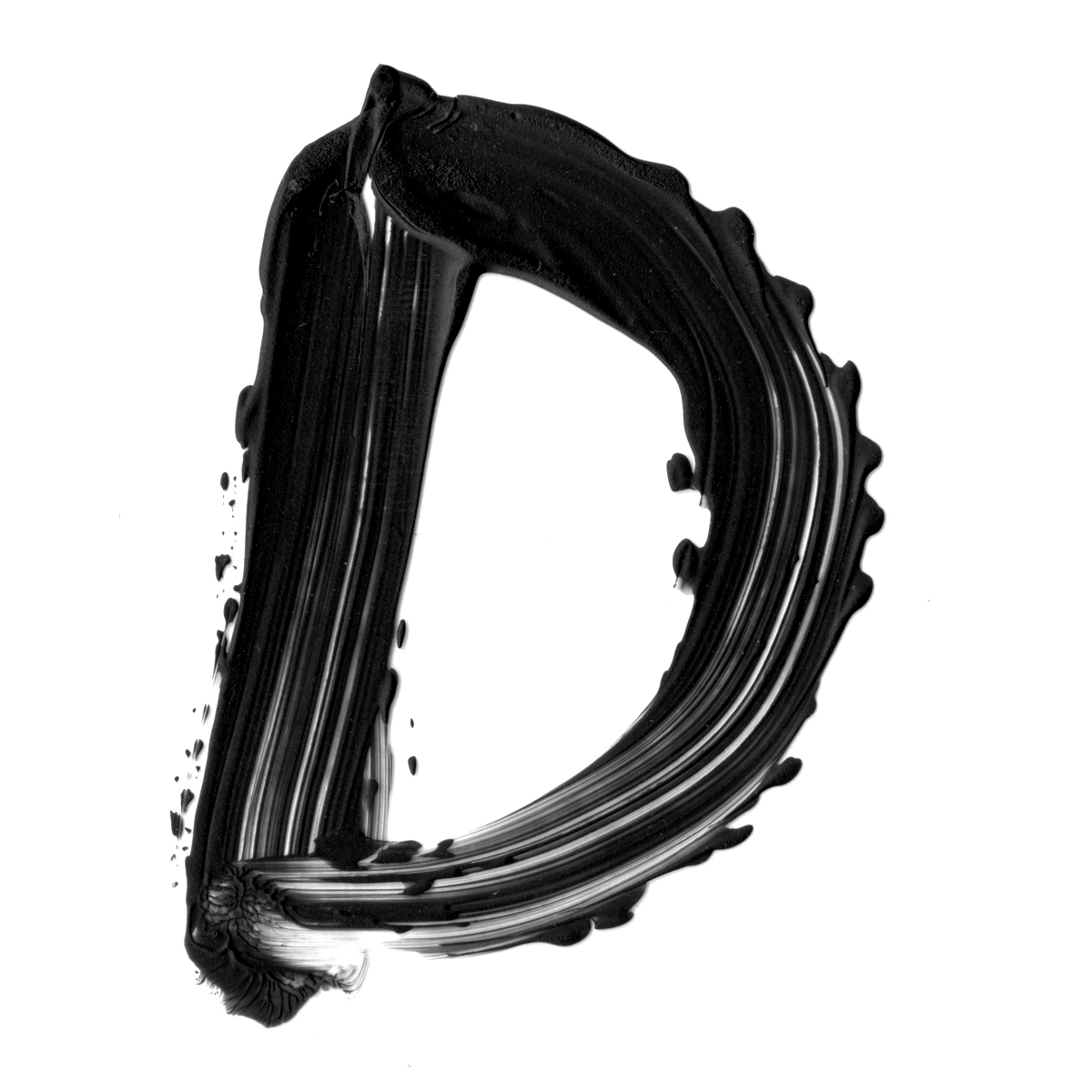
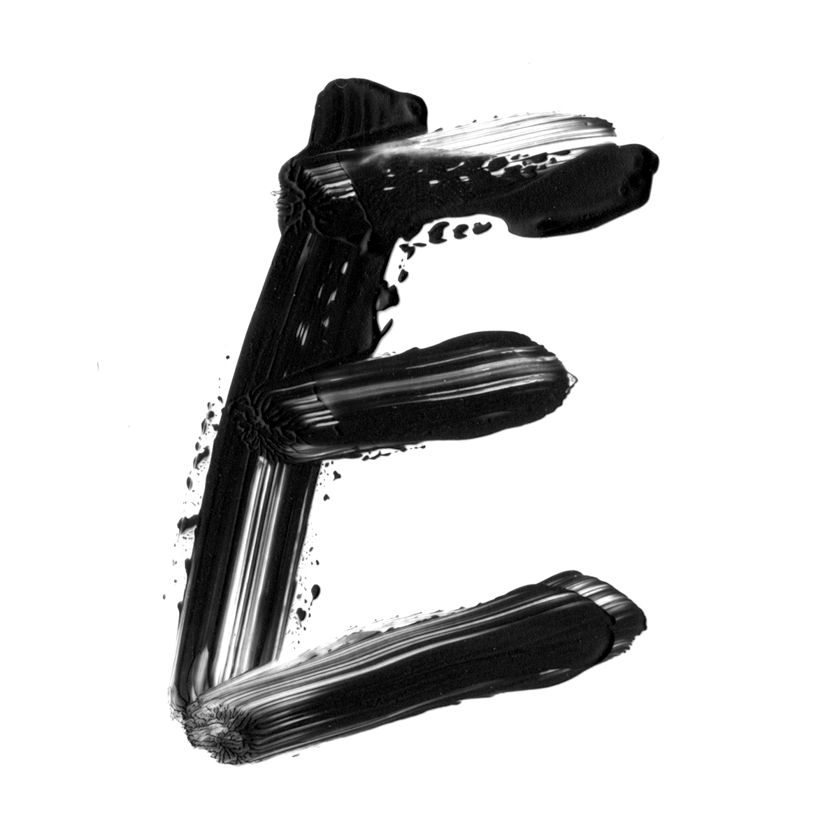
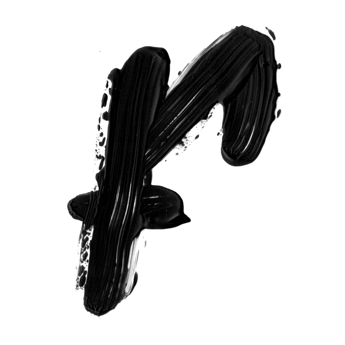
Their new logo is an art form. Representing the fearlessness to create, hands deep in paint. Making parallels to the action of print making, the typeface itself is not perfect, but that is the way it should be seen. Station 16 loves clever art. They promote artists that speak about social issues, life and cultures. It is all about shock value.
The logo is made with a finger, representing the proximity between the artist and the viewer. Creating something more personal, Station 16 has a voice, it has an identity, and it wants to be heard.