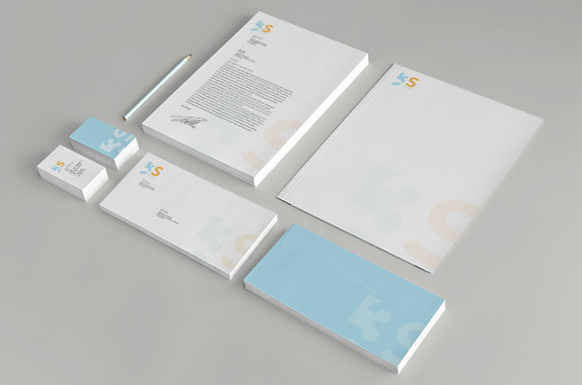
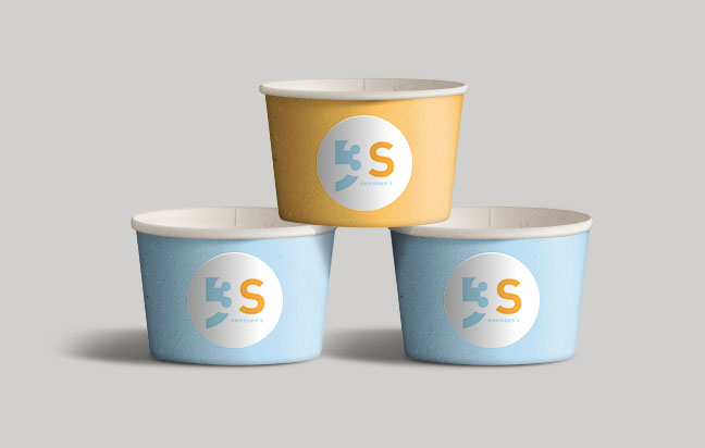
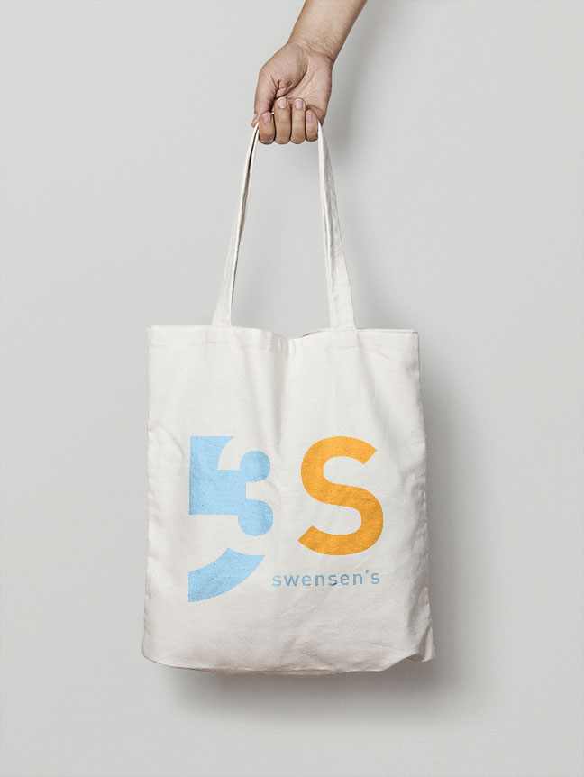
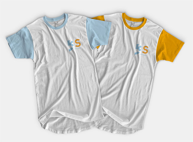
swensen's
Re-branding an existing ice cream company. The goal was to make a logo that represents the face of the company. Swensen’s is now using liquid nitrogen to make their delicious ice cream. The new logo is inspired by the periodic table because that illustrates the liquid nitrogen that is the main attraction of the rebranding. The logo can also be used just the 3 and the S. The main colors of the logo represent the coolness from the liquid nitrogen and the complementary color indicates the flavor of the ice cream.