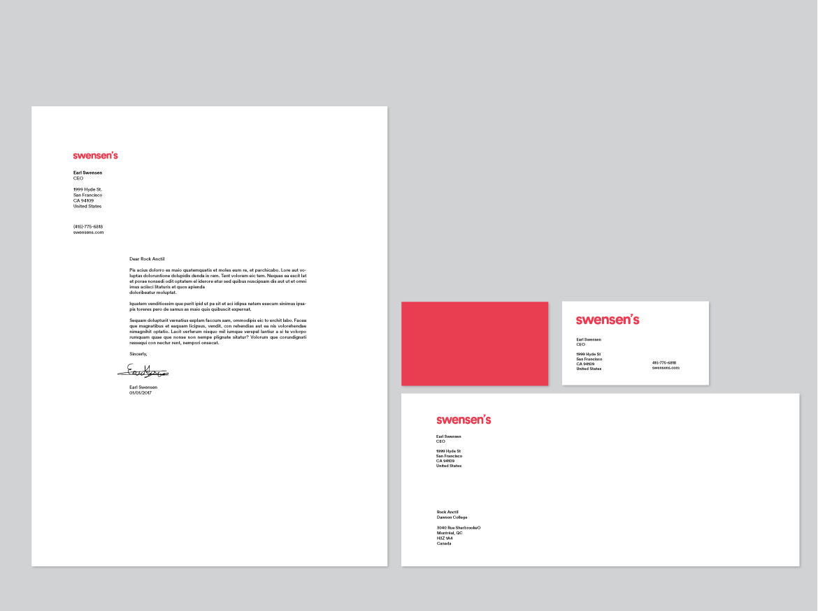
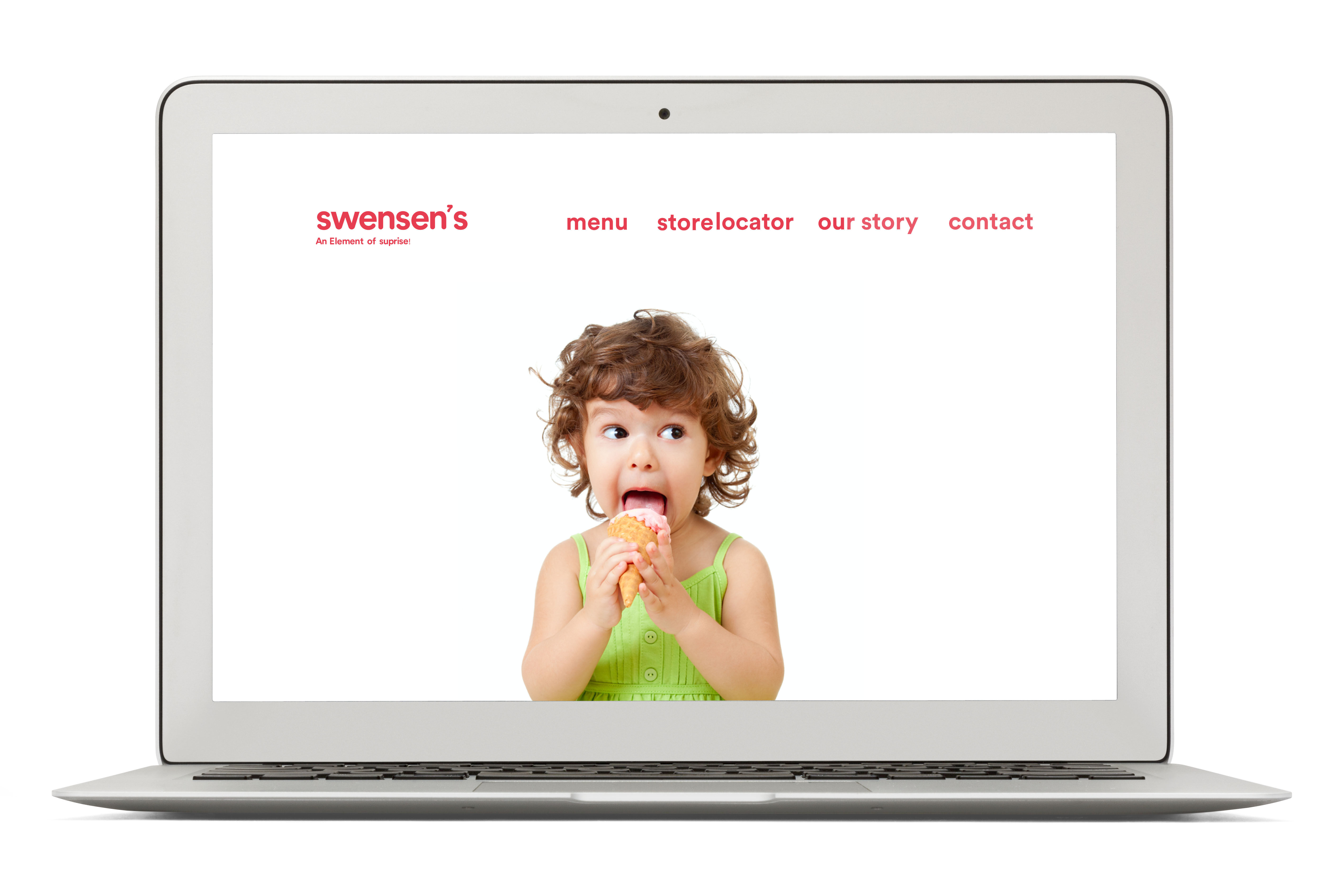
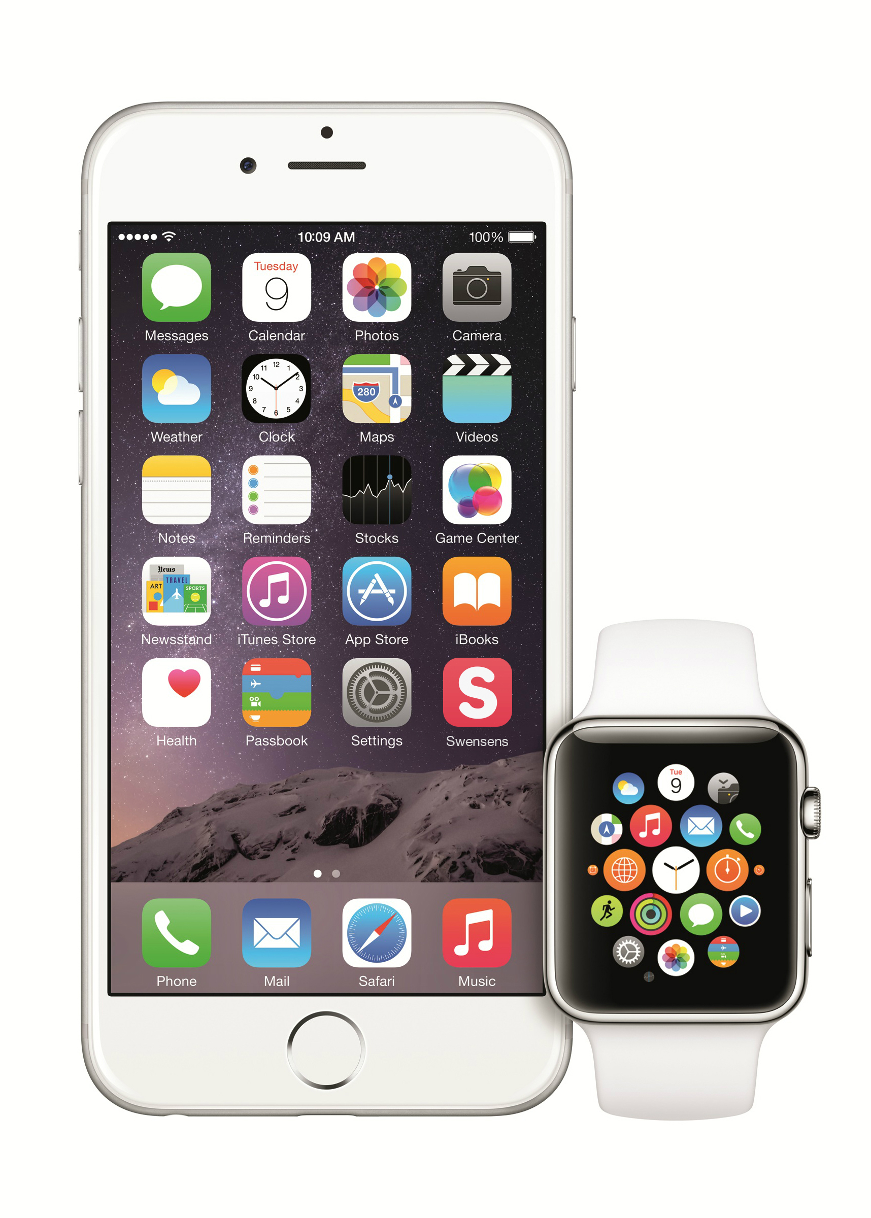
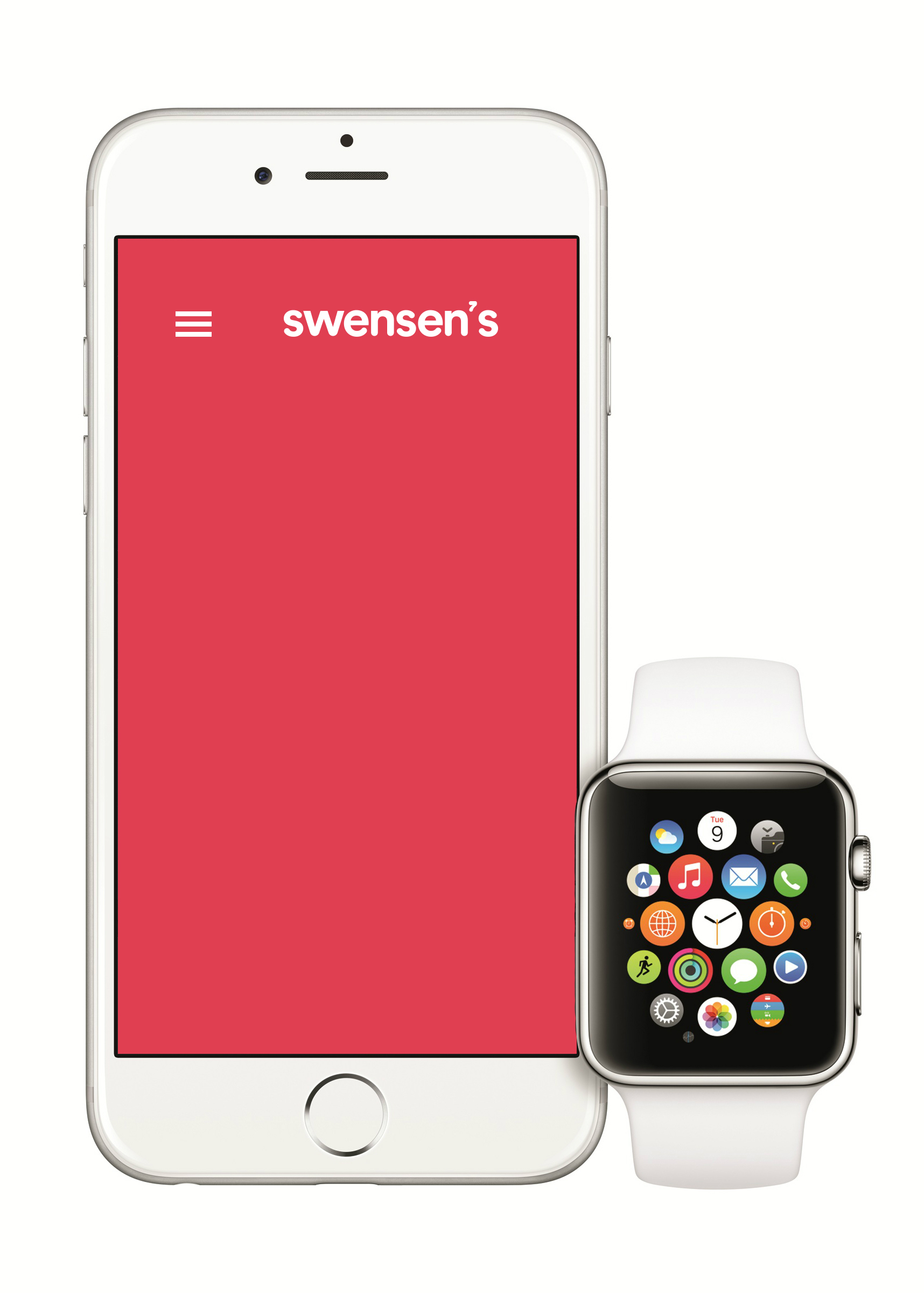
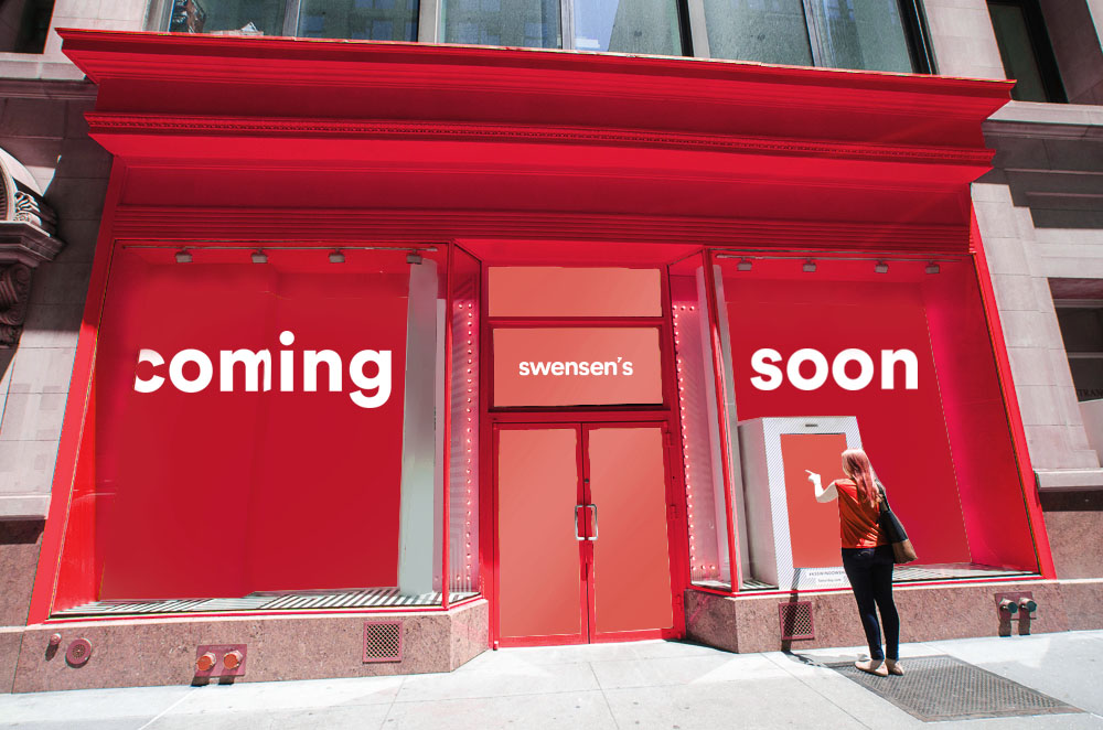
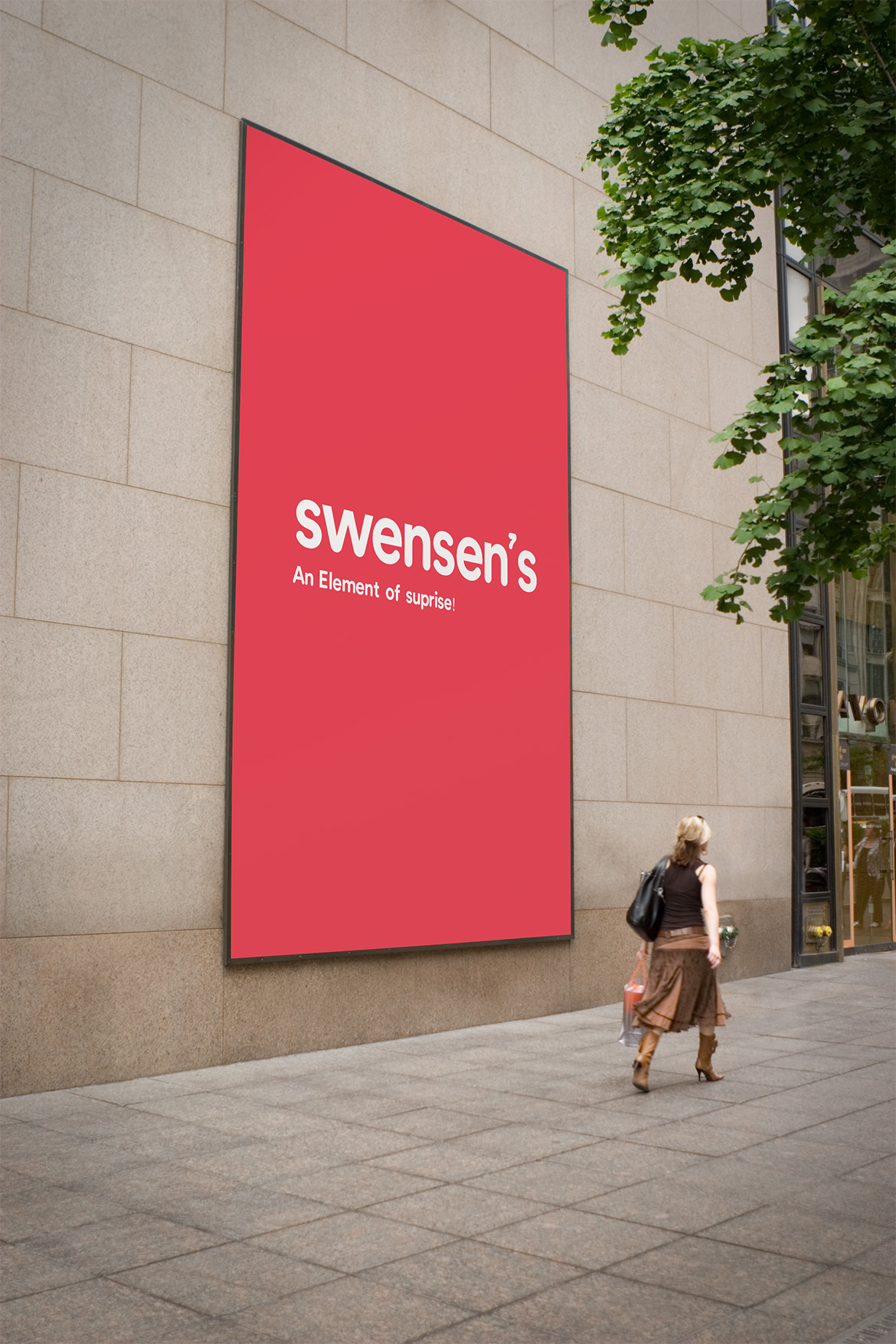
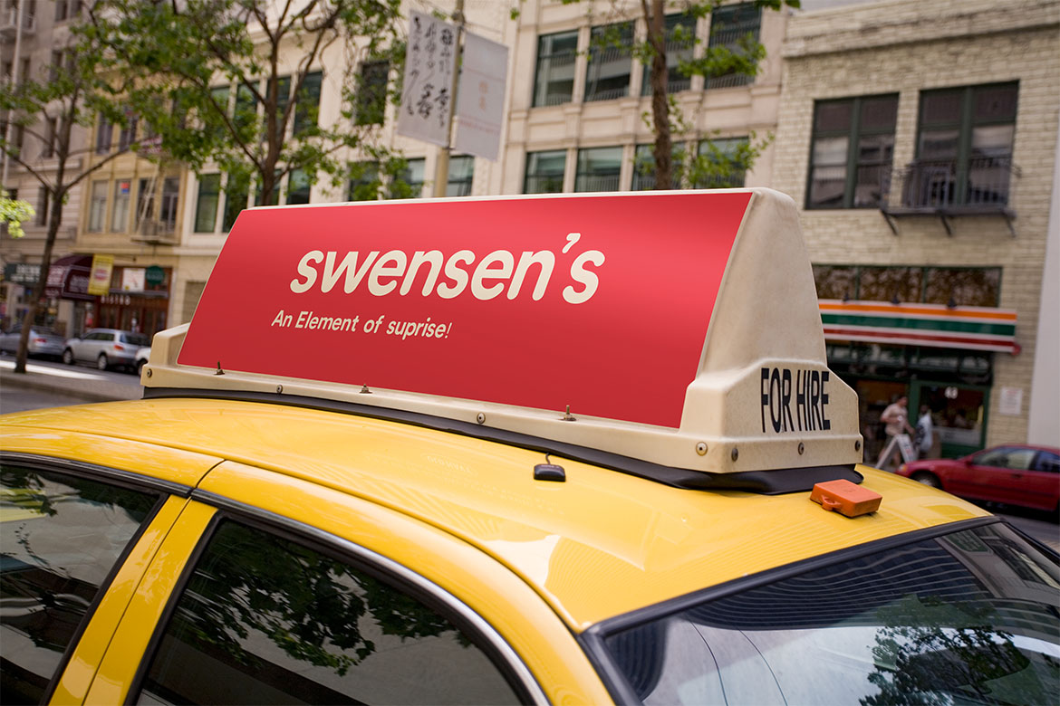
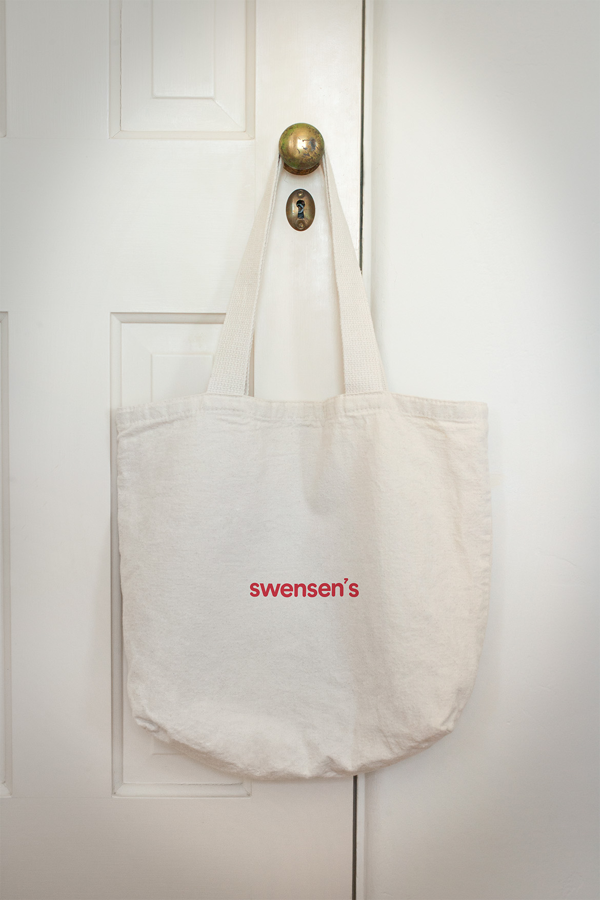
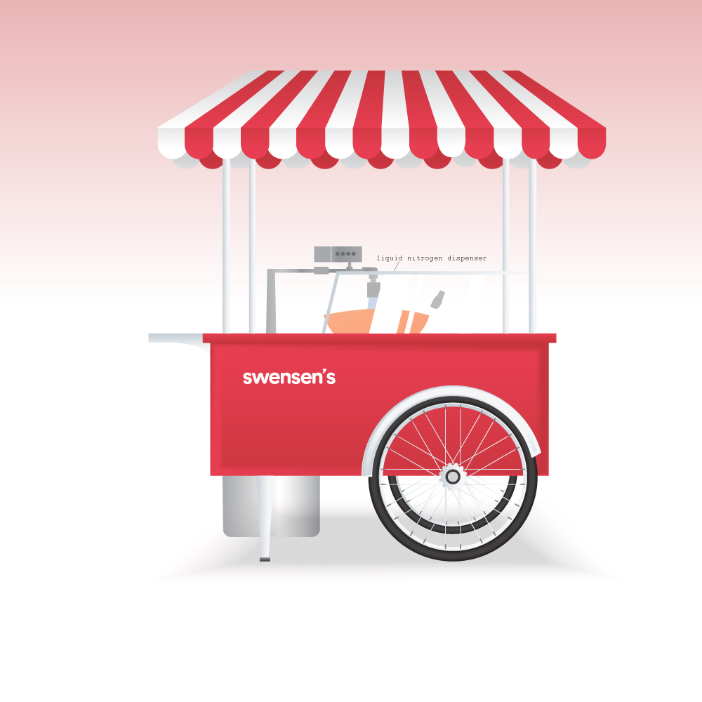
The Mandate of this project was to alter a forgotten pre-existing company to fit a modern lens. My Company was Swensen’s, The Ice Cream Store.
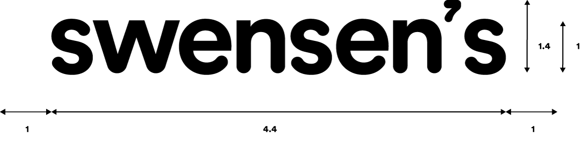
The rationale behind the branding was to take the original logo but give it a more modernized treatment. The apostrophe plays the role of 7, which is Nitrogen’s periodic number in the alphabet.