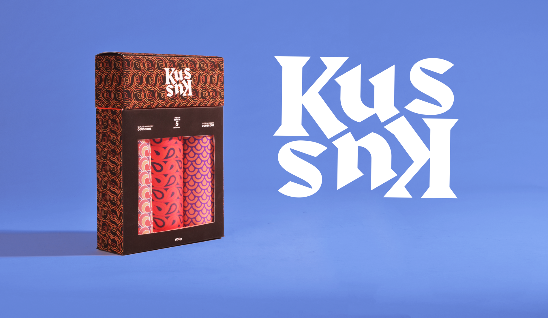

KusKus
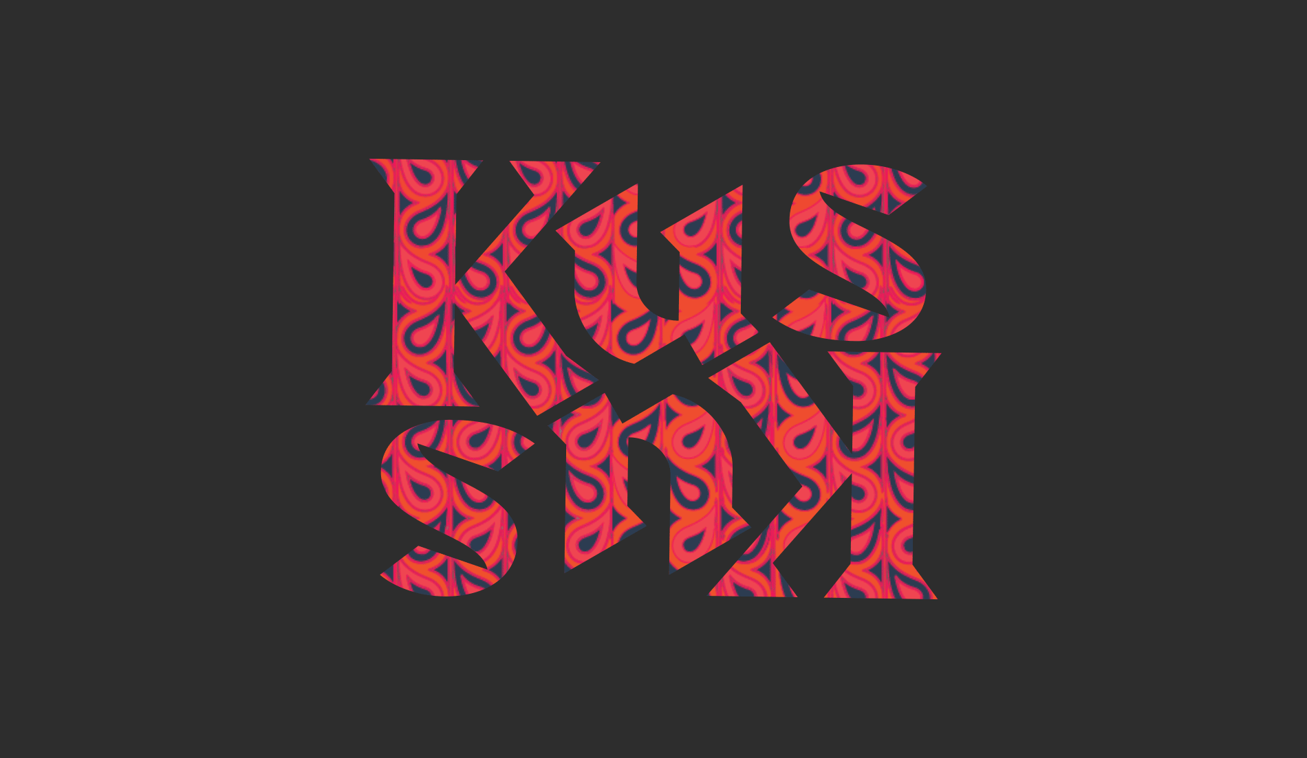
This branding and packaging project has been inspired by middle-east patterns and color. Worlds best quality couscous is produced in places like Libanon, Morocco therefor the logo and every other visual elements and color choices are inspired by the middle-east culture. The logo follows a strong dynamic geometry where the negative space also plays an important role in the composition; the logo was distilled from the phonetics of the word couscous and the grid behind it, enhance the relationship between letters.
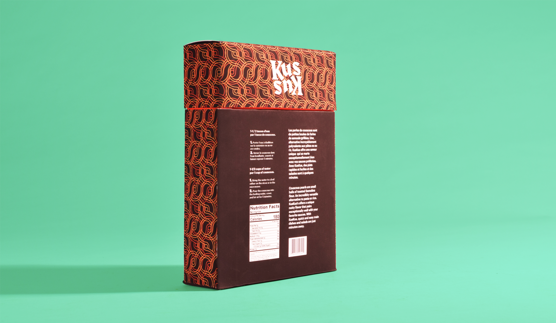
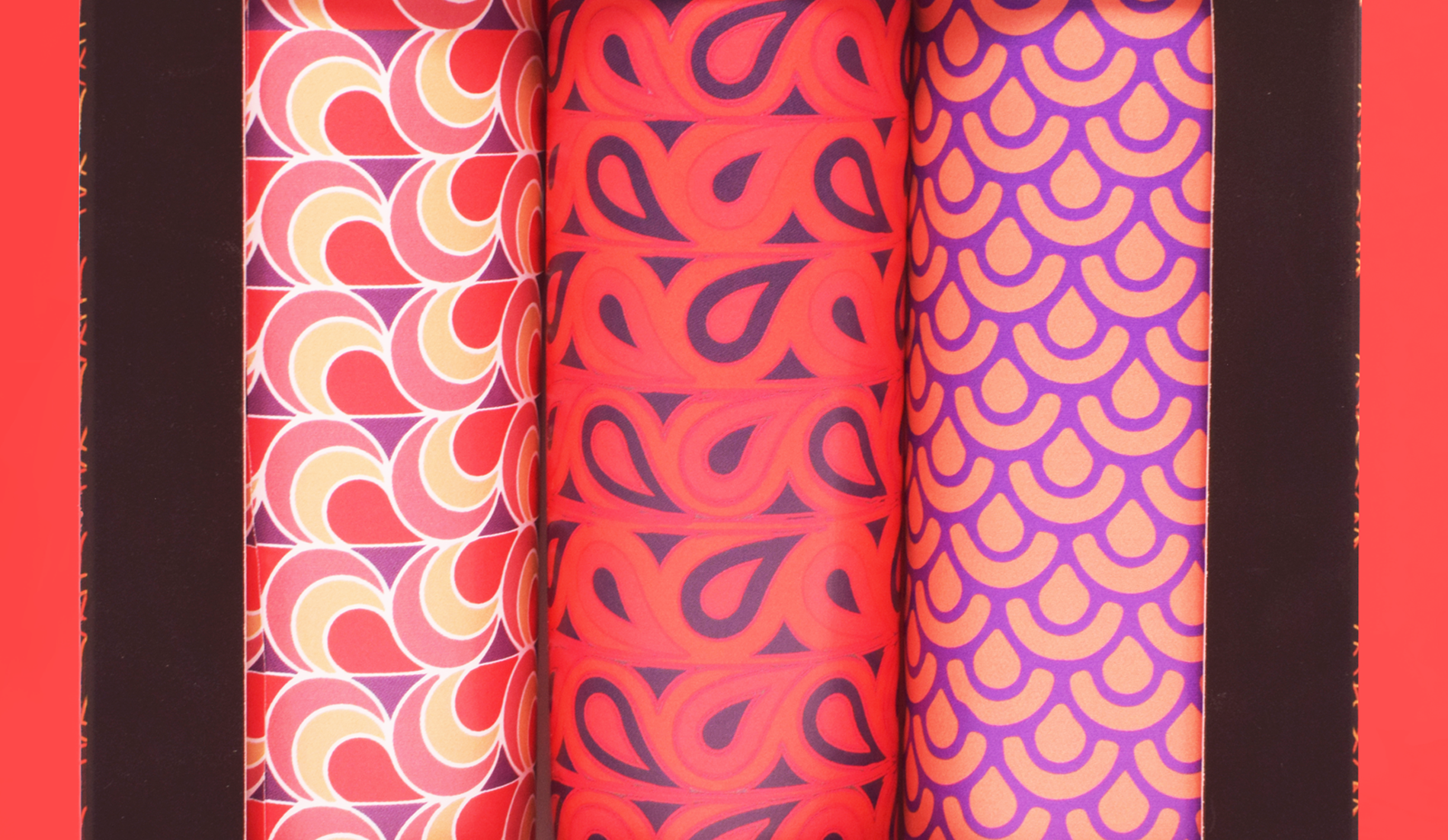
The packaging uses textures and patterns from ancient civilizations that were the pillars of modern middle-east cultures. These patterns were reinterpreted and recolor to better fit the visual standards of the American continent. The packaging itself is a perfect fusion between two sides of the globe in a sophisticated and natural way.