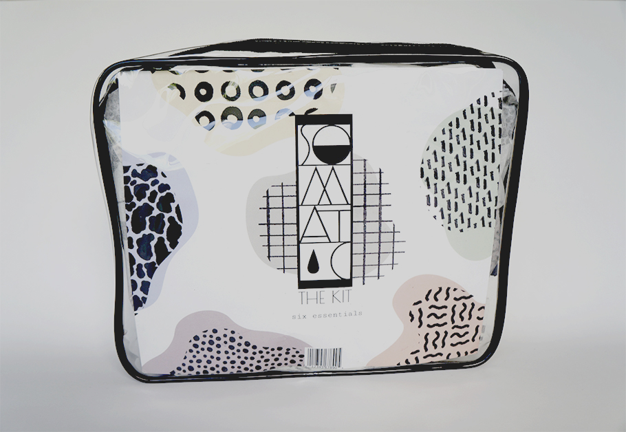
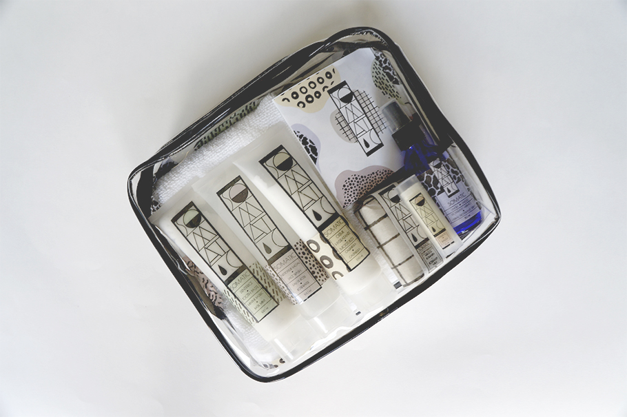
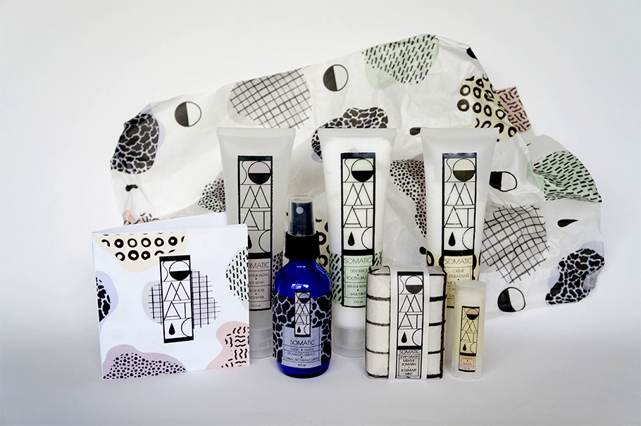
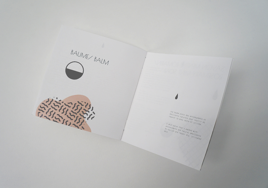
Somatic, "Six Essentials" The Kit. Bath & body product packaging
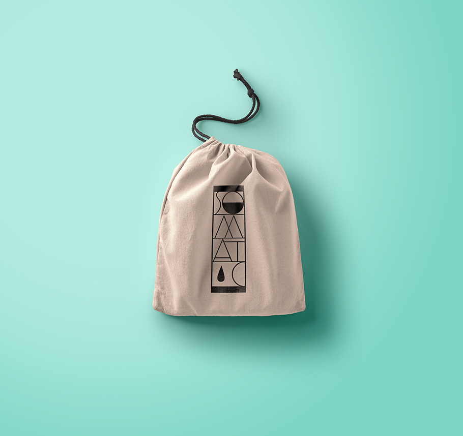
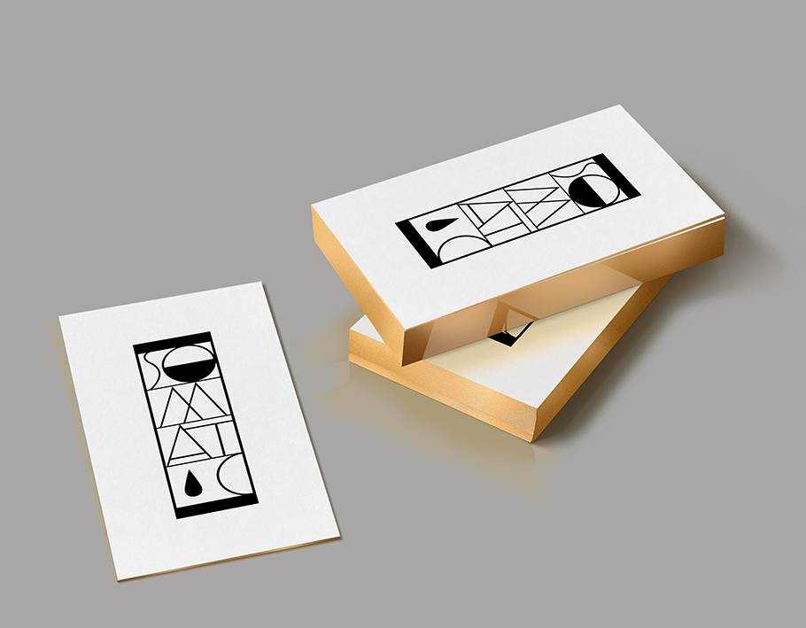
logo design and development for a fictitious company
Packaging Design, Fall 2016
Somatic [soh-mat-ik] of the body; bodily; physical.
The Somatic brand was developed to represent a line of personal care products. The goal of the packaging was to give a clean and playful look and feel to the products that is both fashionable and functional.
The project mandate was to create six new labels for the company's "Six Essentials" kit, as well as; logo design, identity conception and development, while observing consumer packaging and labelling regulations.
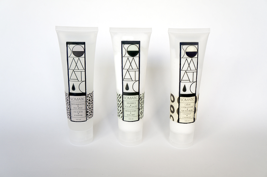
The central concept for this project was "Clarity" both in its literal sense, refering to the ritual of cleaning, and in a figurative sense of "transparency" regarding the integrity of the products and their ingredients. The colour palette corresponds to the individual aromas of each product, and each label incorporates its own pattern, identifying the different items.
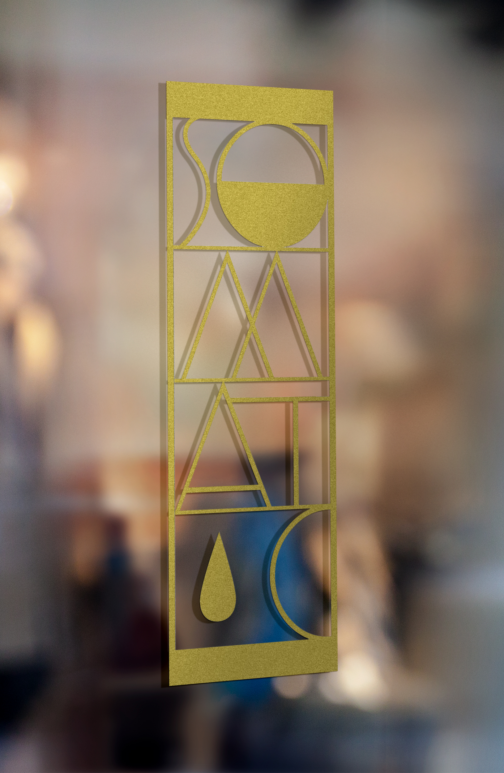
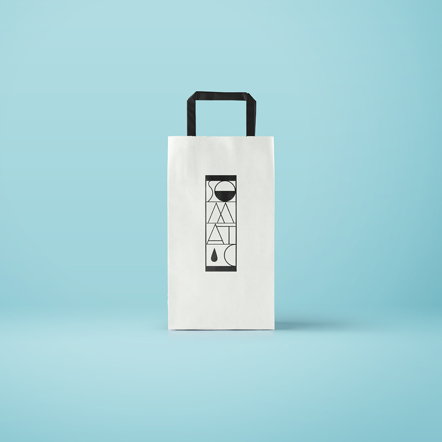
The logo employs an art deco motif, inspired by the aesthetics of the Vienna Secession Monograms.