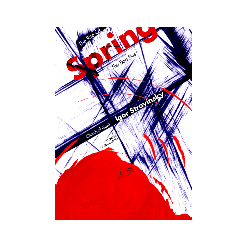
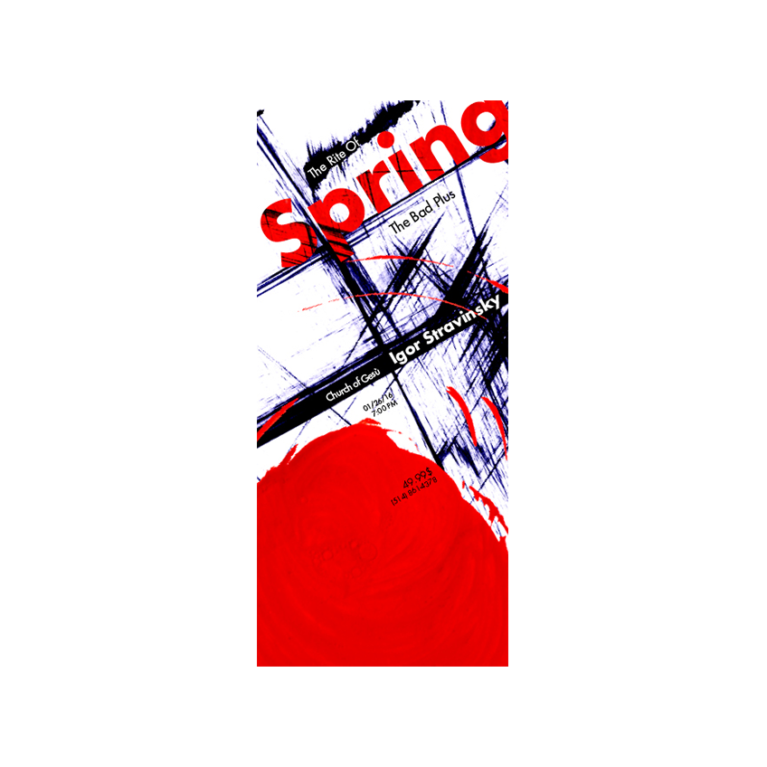
The final design was composed of the three elements that I wanted to emphasize from the beginning. The scratchy lines, the big circles and the text were used as these elements. The album itself “The Rite of Spring”, was used as a sacrificial dance. Although the color scheme started as orange and blue, it later changed to red to represent the blood spilled by the sacrifice. The circular direction of the red circle represents blood being spilt during the dance in which the people are usually surrounded in a circle. The word “spring” contains the red of the circle to signify its importance.