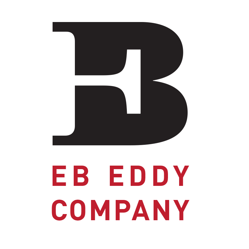
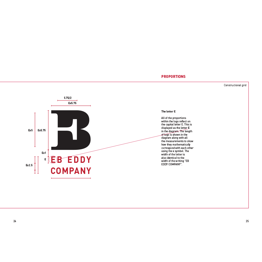
The rebranding for EB EDDY Company consists of modernizing their small publishing supplying company. The logo consists of the capital letters “E” and “B” with a clear sans-serif font displaying the full name. The capital letters have been merged to use the arm of the capital letter “E” within the “B”. The symbol that is created gives a strong corporate look. The symbol can be representative of the company in many ways. Firstly, the serifs of the letter create an illusion of the spine of a book. Secondly, the proportions of the symbol are relatable to most paper sizes. Lastly, the serif typeface gives an association with their history. Also, the sans-serif typeface shows the modern resuscitation of the company.