


School project; Branding identity for Cine Express.
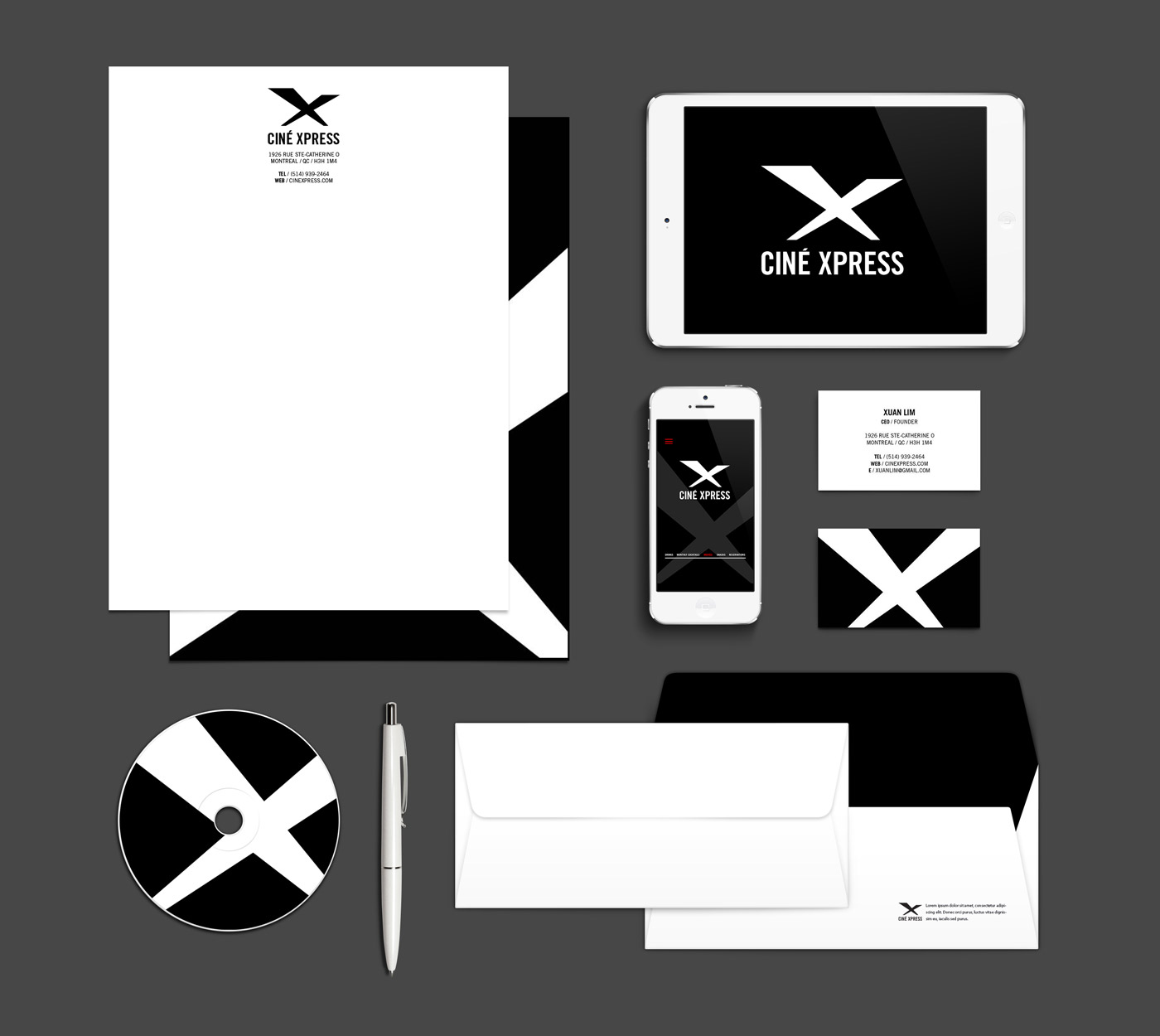
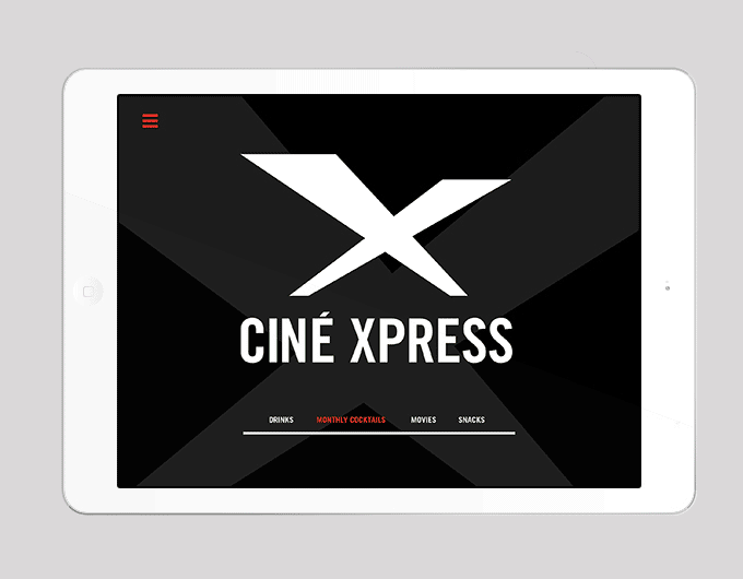
Cine Express is a constant growing company, and with growth comes change. The new design language, brings a whole new view and feel to the table, emphasizing on the modernity of the film industry, but keeping in mind certain traditional characteristics.
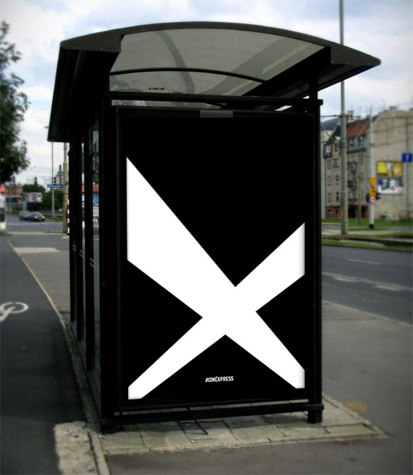
The inspiration behind the final logo design was developed through the research of movies, movie theatres, projections, and cinema in general. Because the name of the company is Cine Xpress, It felt necessary to use of the "X" as the initial focal point. Visually it is a strong and defining letter/symbol; it's bold characteristics work well with the cinematic industry. The idea of projection lights plays a huge role in the construction of this logo. Inspired by the visual effect of the projection lights, the idea stemmed from the motion in which the lights take on; for example at red carpet events and galas. Also the fact that the majority of films these days are digital projections seemed quite appropriate. Because the target audience is young adults, mainly students aged 18-28; the stationary and applications must be fun, young and modern.
Viewer Discretion is Advised.