The brief was to take an existing logo and modernize it, making it more relevant and accessible to the target market. The Frog Mountain Festival (formerly Frog Food Festival) is an existing festival based outside of Whitehorse, Yukon, promoting local music, food and merchants. Festival goers from far and wide camp out on the base of Frog Mountain for 3 days, enjoying the local culture.
the geometric shape of the logo is inspired by the Yukon terrain, and the color palette from local photography.
Note: this was a school project and the organization was not involved
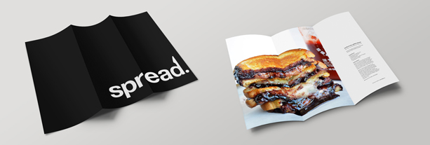
spread. jam
spread. wants to modernize the jam market by marketing a fresh, modern approach to traditional jam. When was the last time you truly tasted real, natural jam? Let spread. bring you back to those lazy Sundays when the sweet smell of jam met the charred smell of toast as you skirted around your mother's feet in her kitchen.
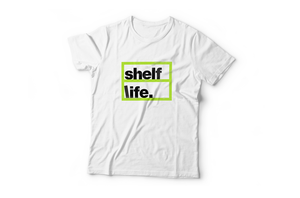
shelf life
This logo was designed for a fictional youth library named Shelf Life. The company, name, logo, color scheme, and applications were all designed for a target market open to a non-traditional approach to traditional library space.


