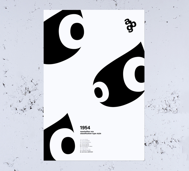
a poster design based on the type classification system of max vox, a multi disciplinary french typographer.
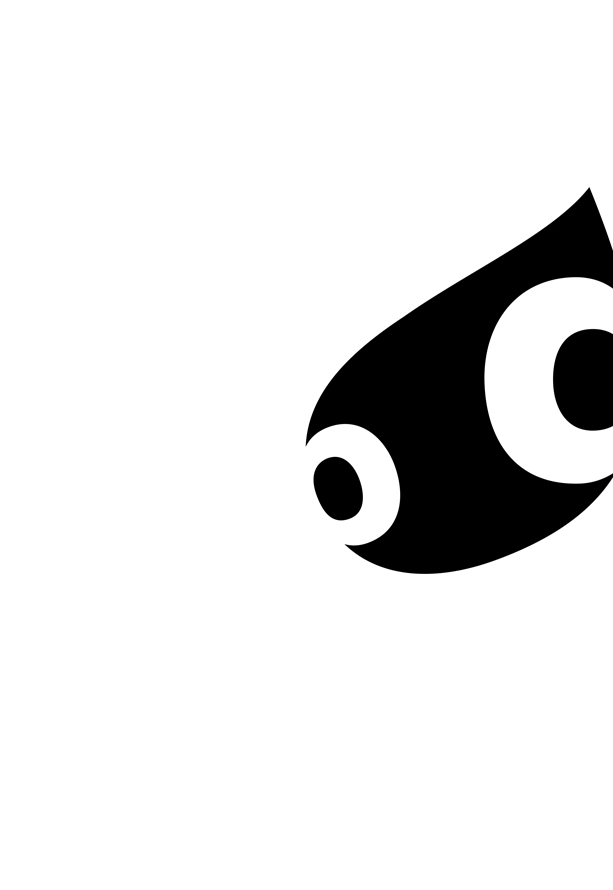
after various typographic explorations, i noticed the helvetica a had an extremely distinctive counter. Adding bowls from the lowercase g and b added eyes, which brought the shapes to life. Tightly spacing the a, b, and g also revealed an arrow in the negative space, which points in the direction the creatures are going.


