santropol
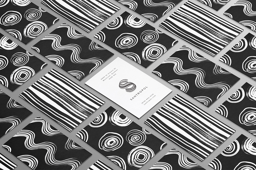
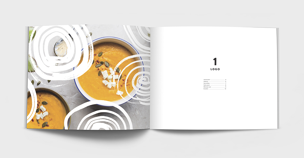
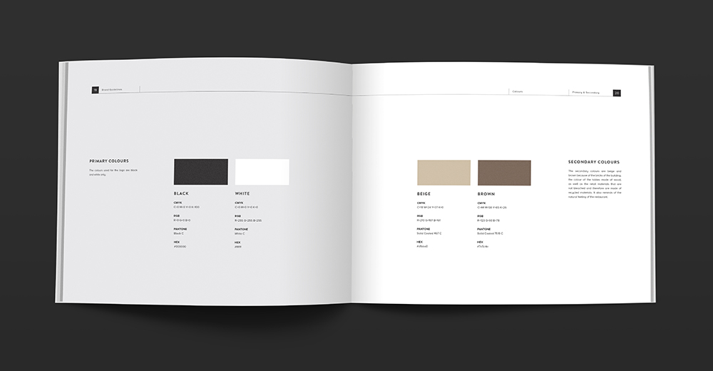
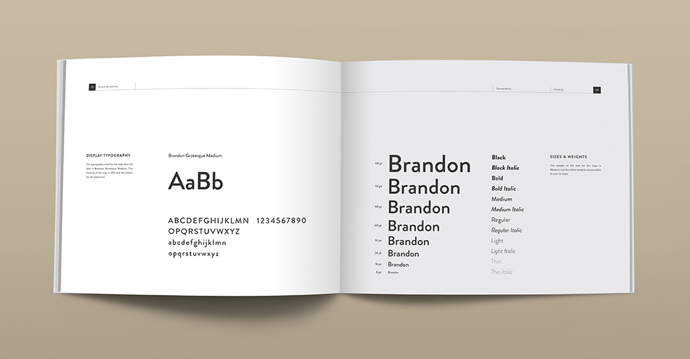
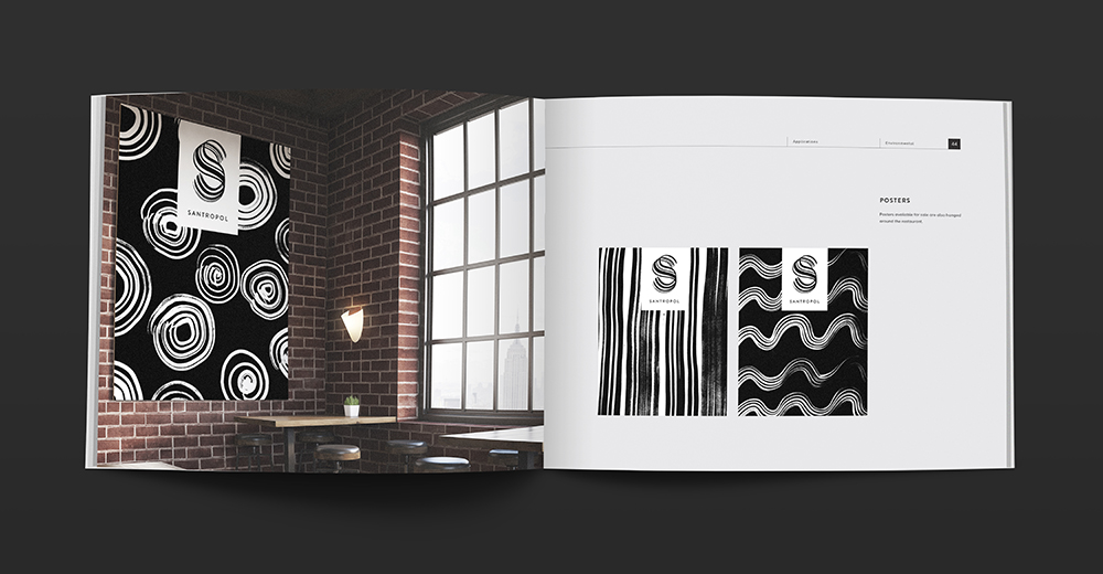
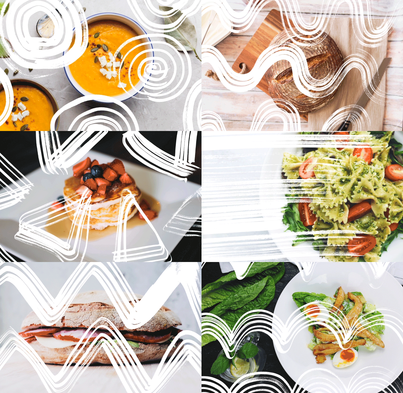
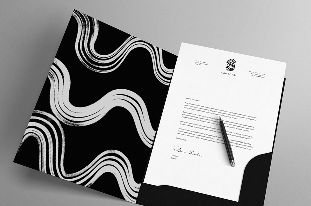
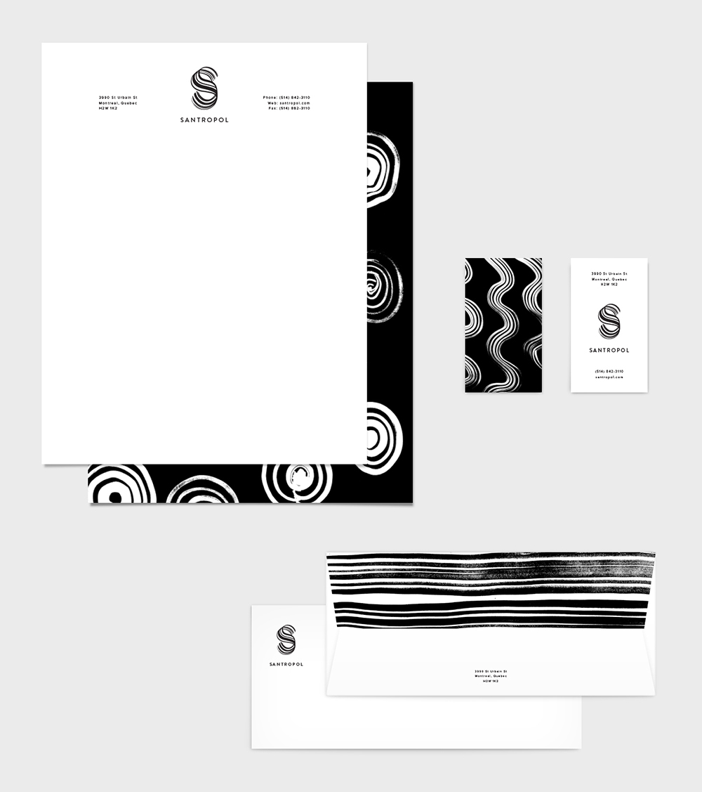
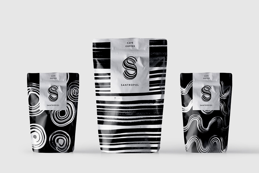
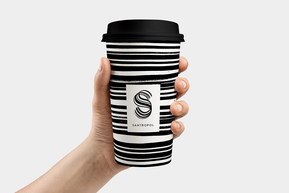
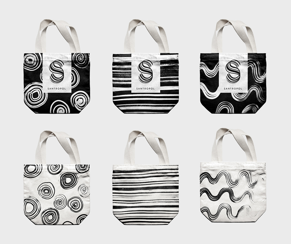
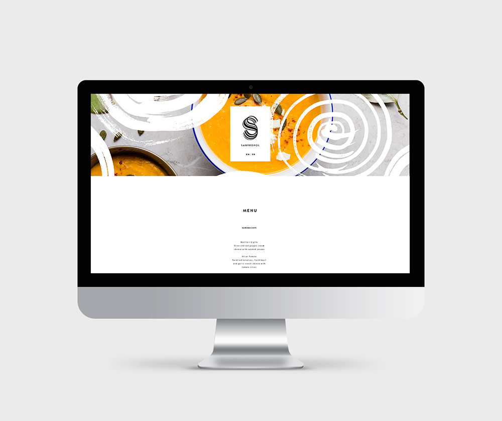
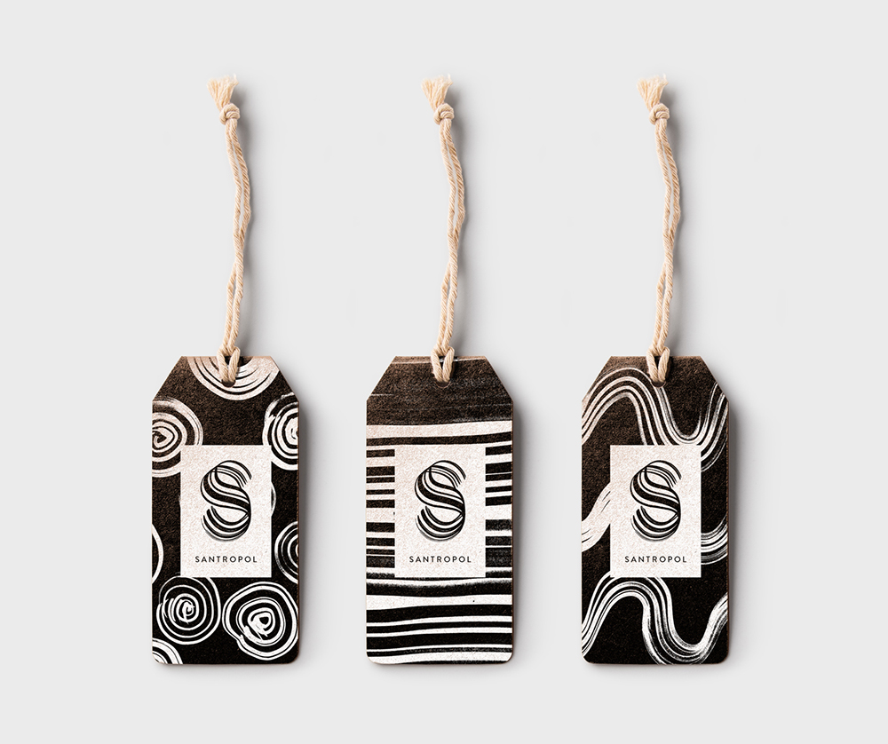
Semester 6 - Creation of a new branding for the eclectic and cozy restaurant Santropol. The logo is handmade, representing the restaurant’s unique and natural decor, composed of organic elements such as plants, trees, and wooden furniture. The strokes have different weights, adding a sense of contrast, unpredictability, and delicacy. It has both has a vintage approach by being handmade, and a modern look with the help of the symmetry, the simplicity, and the sans serif typography Brandon Grotesque that is round, geometric, and fresh. The textures are handmade with the same brush as the logo, forming different patterns that are placed over pictures of food and used for applications. The colors are mostly black and white to emphasize the colourful food they serve. There is also some brown and beige for the applications since the restaurant is environmentally-friendly and prefers not to use bleached materials. A brand guidelines book was created to present the logo, typography, colours, visuals, stationery and applications.

 ❮
❮