polyphony vernissage
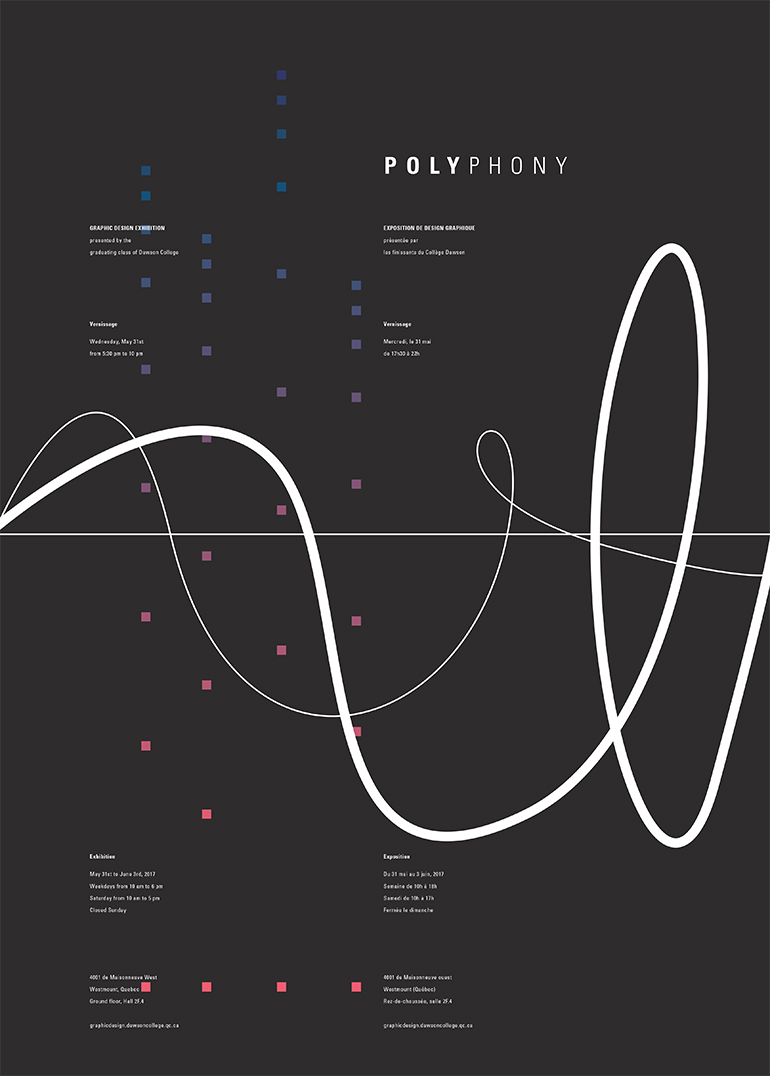
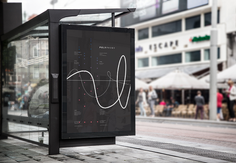
Semester 6 - Poster representing the graduating class of 2017 for our vernissage. Since we all have different qualities and complement each other, forming a strong group, I chose the word Polyphony to describe our energy. The poster translates the word into figures; three different lines go through the width of the poster and squares of different colours ascend. The two elements complement each other and create a sense of rhythm, contrast, scale, balance, repetition, and unity. These are important elements in graphic design as well as in music. Polyphony: (noun) in music, the style of simultaneously combining a number of parts, each forming an individual melody and harmonizing with each other.

 ❮
❮ previous project
❯ next project