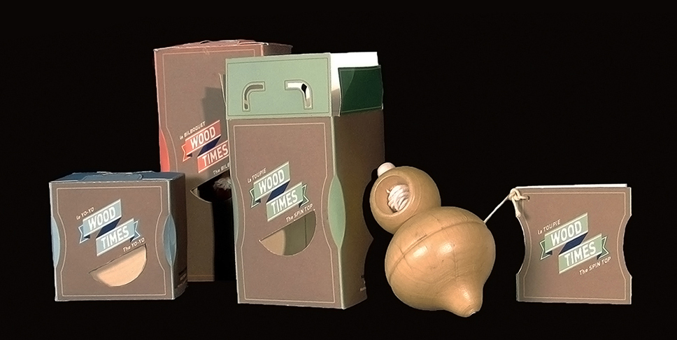
Wood Times
A packaging design for Wood Times, a Montreal-based company that hand makes wood toys. Their goal to promote a sense of nostalgia and appreciation for simpler times is highlighted through this packaging design for the three wooden toys (the yo-yo, bilboquet and spin top).
I made the decision to keep the packaging’s design simple to let the wood be the star of the show. The colour of the packaging was kept a darker brown to let the pale wood shine through, while the die cut window gives a peak of the toy’s shape.
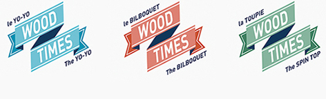
Simple changes in the packaging’s accent colour differentiates each toy while maintaining the idea of a unified set. The logo design itself is modified along with the accent colours and speaks of the company’s adaptive yet stable nature.
The ribbon design is reminiscent of older styles, while painting a modern look, and speaks of games, playfulness and quality.