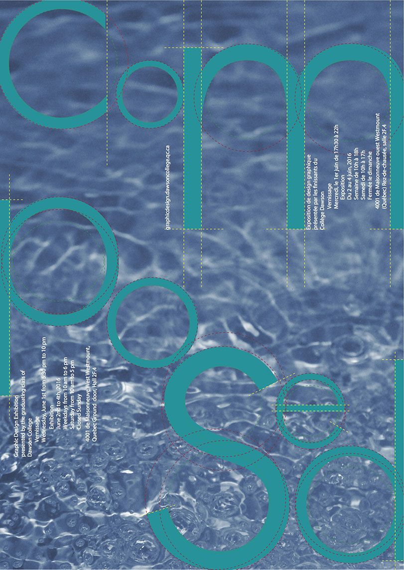
Vernissage 2016
Adobe Illustrator and Photography
The poster was a part of my Promotional Design class in my final semester of college. The objective was to take a word that relates to the three years of Graphic Design. Composed was the word chosen in my case. It relates to the composure we are to feel when completing the program. It also relates to serenity by having less stress. The type was a font found online and the lines around it accentuate the geometrics of how the typeface was made. The background is a photograph of water.

 Stephanie D'Arienzo